18 years after its original release, my all-time favorite video game is now available on iOS. Crazy.
♤ ♧ ♡ ♢
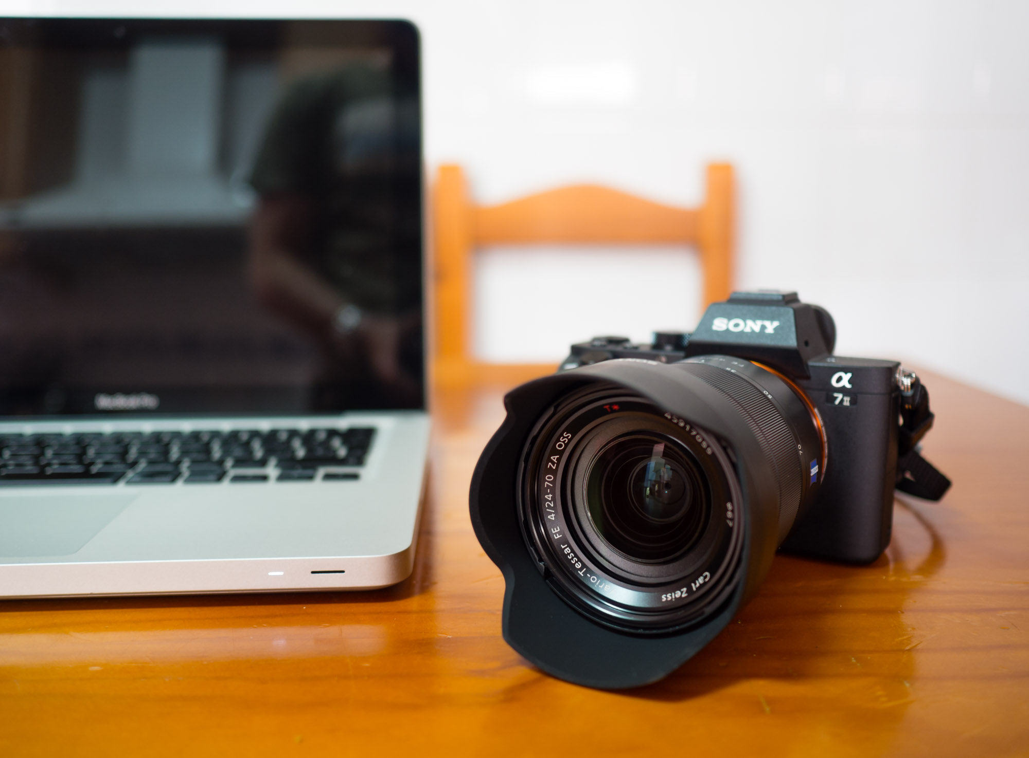
First contact: a walk around Plasencia with the Sony A7 Mark II
This past weekend I went to my hometown, Plasencia, to visit my family. It was the perfect opportunity to take my new Sony A7 II and the Zeiss 24-70mm f/4 lens for a walk around the old town. Having never owned a proper wide angle lens before, this was also a first for me.
Plasencia is a small but beautiful city in Western Spain. Founded in 1186 by King Alfonso VIII of Castile, the city presents a very special mixture of Christian, Muslim and Jewish cultures. In my walk I mainly visited the Jewish borough, which is known today as Barrio de los Caballeros and includes many of the most beautiful architectural highlights of the city, with the exception of the impressive Roman aqueduct.
Let me show you around for a while.

Plasencia is a walled city, with most of the wall still preserved in great condition today.

Narrow, stone-walled streets are a typical sight in the old town.

In some places, you can see where new buildings swallowed up the old stone walls of the city.

This Palace was built by former Dukes of Plasencia, Don Álvaro de Zúñiga and Doña Isabel Pimentel, in the 15th century.
The picture above is a great example of what a 24mm wide angle lens can do. I was standing really close to the building and still managed to completely fit it in the frame. I definitely need to get used to this focal length and learn to work with the distortion, but so far, I’m really liking the new creative choices it puts at my disposal.

Church of San Nicolás, 13th century.

Church of Santo Domingo (St. Dominic), founded by the Zúñigas in the 15th century.
This picture of St. Dominic’s required massive shadow and highlight recovery, and the end result is still pretty decent. It seems the sensor in the A7 II really has some nice dynamic range to work with.

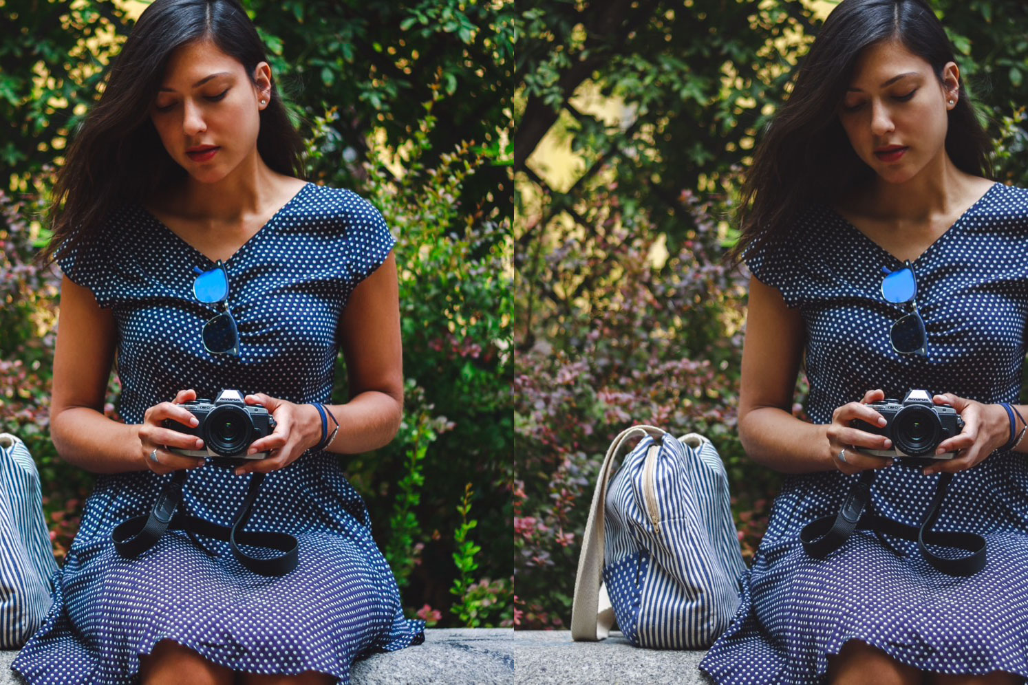
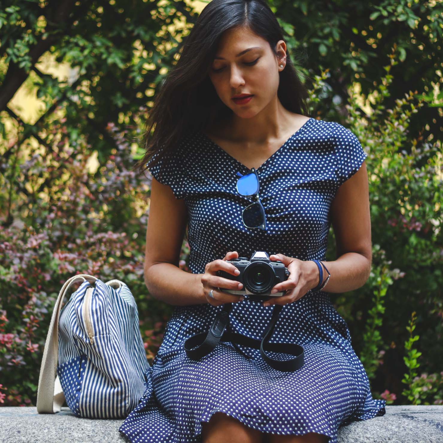
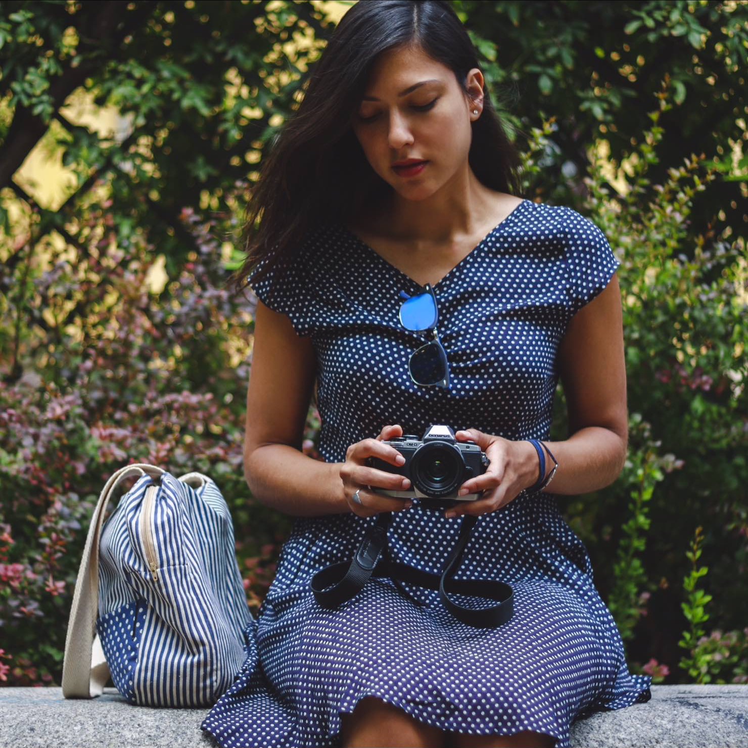
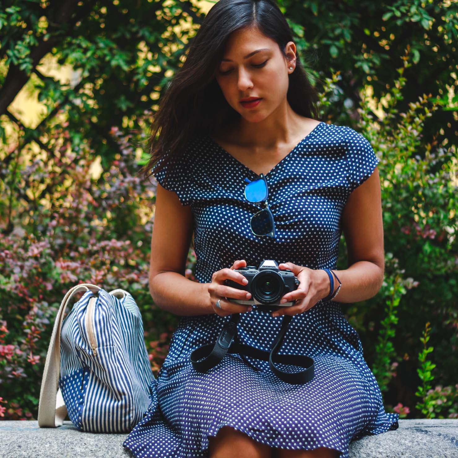
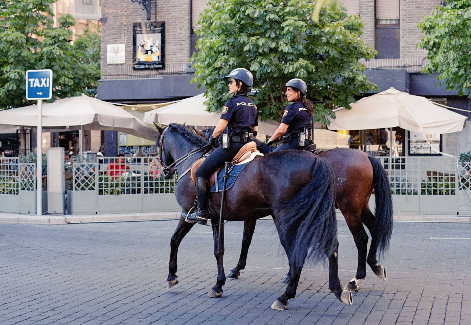
Miriam in front of San Nicolás.
This picture of Miriam was taken at 61mm and f/4. I wasn’t even fully zoomed in to 70mm and the Zeiss 24-70mm zoom still managed to achieve some degree of subject separation. Granted, at f/4 this is clearly not a fast prime, but in a pinch, it works.

The great thing about having more pixels is that you can crop a bit more and still get plenty of detail in the final shot. Here, for example, I just cropped the sides and magically turned a landscape picture into portrait orientation (I know, I know).

Palacio del Marqués de Mirabel, front entrance.
At 24mm and f/4, the possibilities for subject separation are slim to non-existent. Here I was standing close to the lens’s minimum focus distance and still didn’t manage to throw the background out of focus a great deal. Clearly I have to learn to work with the constraints of this lens, not against them.

Plaza de San Vicente Ferrer, front entrance of St. Dominic’s.

Casa de las Dos Torres, early 14th century.
This building is officially named Palacio Monroy, but is commonly known as the House of the Two Towers. Back when it was initially built, the building featured a second tower at the right side, which was demolished in 1913. It is the oldest mansion in the city.


New Cathedral, 16th century. I ran into a wedding photo-shoot near the New Cathedral, which was fun to see — I actually knew the groom from high school!
Plasencia is perhaps unique in that there are two cathedrals in the city. The Old Cathedral, known as St. Mary’s, was started in the 13th century and finished in the 15th century, and represents a great example of the transition between Romanesque and Gothic architectural styles.
The New Cathedral was started in 1498 and work progressed until 1578, when construction was halted. Work on it began again during the 18th century, but it was never fully finished. This is obvious in the central area of the above picture, where the brick wall that was used to close the unfinished structure is clearly visible.

Plaza de los Naranjos.


Plasencia’s food market is located right in the old town, surrounded by medieval churches and close to the city’s Plaza Mayor (main square). This makes for an interesting contrast, and it’s an example of something that makes Plasencia’s old town special: it is still mostly inhabited by long-time residents of the city, not exclusively devoted to tourism.


Plasencia’s traditional food market remains in use.

St. Dominic’s convent.
Plasencia has always been a deeply religious city, with more churches per citizen than many other cities in Spain — and the world, for that matter. Even more, beyond regular churches, there are still several enclosed religious orders active in the city. This is a picture of St. Dominic’s convent. Those small barred windows at the top represent the only contact St. Dominic’s nuns have with the outside world.

An elderly woman attending mass in the church of San Esteban, 15th century.

Plasencia’s Plaza Mayor, or main square.
Plasencia’s City Hall is located right in the main square. The palace was built during the 20th century, but was based on the style of 16th-century architect Juan de Álava.

Plasencia’s Palacio Municipal, where City Hall is located.

Another thing that separates Plasencia from many other Spanish cities is its main square. In most other medieval cities across Spain, the main square has been almost completely taken over by tourism-oriented businesses. Unfortunately, that means long-time residents can’t enjoy these places anymore due to artificially inflated prices. In Plasencia, however, the main square remains local territory, fiercely defended by its people. Every day you see familiar faces all around, and every bar has someone inside waiting to greet you by name.
I really love Plasencia’s Plaza Mayor and its bars. Alas, that’s a story for another day, for our walk is now reaching the end.
Afterword: first impressions on the camera and lens
All these pictures were casually taken in the scope of a couple hours, while I was still getting used to operating the camera’s basic controls. With that in mind, please excuse any technical errors you may have noticed.
I fully intend to do more walks like this in the future as I get more comfortable with the camera. For a first contact, though, I’m pretty happy with how things went. If you’d like to see the full resolution pictures, they’re available as a Flickr album.

Miriam with my OM-D E-M10.
To be perfectly honest, my first impressions on the Sony A7 II could hardly be any better. After just a few hours of use, it feels like a compelling upgrade from my Olympus E-M10 in every way. It’s still early days, though, and the camera is not without its quirks. I expect to slowly get to know my way around it better in the coming weeks.
I’m similarly impressed with what I’ve seen from the Zeiss 24-70mm f/4 lens so far. The build quality is excellent, and the lens handles like a dream. In a couple quick comparison shots I’ve taken, it’s also clearly sharper than my Olympus 17mm f/1.8 prime on my E-M10, when both lenses are shot at comparable settings (17mm f/2 for the Olympus, 34mm f/4 for the Zeiss). That’s impressive performance indeed. I’ve noticed soft corners at 24mm wide open, but that’s something I’m more than happy to live with in exchange for everything else the lens has to offer. Only time will tell if it becomes an everyday shooter for me — after all, I’m a primes-first man — but for now it’s shaping up to be an excellent travel lens, at the very least.
On the not-so-great aspects I’ve noticed, I’ll say handling of the A7 II’s RAW files in Lightroom seems finicky, to put it mildly. I’ve struggled to find a camera calibration profile I like, and there are wide reports on the Internet of people being unable to replicate the colors they get with their JPEG shots when shooting RAW. This is apparently an issue that affects all A7-series cameras, by the way. That said, I don’t mean to knock Sony down over this — after all, it could very well be a Lightroom-related issue. In any case, I suspect it’ll be a matter of learning how to process the files better, but it’s a problem I never really faced with the Olympus camera, so there’s that.
Finally, I’m looking forward to spending more time with the camera and really getting to know all its features better. I feel like I’ve only scratched the surface of what this thing can do, and I’m super excited to find out what lies ahead for me.

♤ ♧ ♡ ♢

Another week, and another issue of Morning Coffee to help you relax and recharge your batteries over the weekend. If you’re into photography, you’re in for a treat this week.
Issue #10: A7-series galore, with a side of social commentary
As regular readers will know, the past few days were spent largely in anticipation of receiving my new camera, the Sony A7 Mark II, together with the Sony Zeiss FE 24-70mm f/4 OSS lens. As such, a number of links in this week’s issue are photography related and, more specifically, A7-series related.
I finally received both items yesterday, but a bit more on that later. For now, let’s focus on some interesting pieces of writing.
Enjoy.
Sony A7 with the Canon 50mm f/0.95 dream lens | Paul Marbrook →
Some really incredible pictures in this piece by photographer Paul Marbrook. The Canon 50mm f/0.95 was a remarkable lens in Canon’s lineup, the fastest lens Canon ever produced. It was made in the 1960’s and it was a rangefinder lens, designed for the Canon 7 rangefinder camera. As these images show, the lens had a unique “dreamy” rendering that instantly became a huge hit. Sadly, the lens was discontinued decades ago, so finding one in good condition today is pretty hard, and expensive. If you can find one, though, I’d advise jumping on it immediately.
♤
No Pants Day #9 - Canon FD 50mm/1.4 versus Sony FE 55/1.8 | Sebastian Lee →
Another interesting piece comparing a Canon legacy lens with Sony’s current fast standard prime for the FE-system. It’s amazing just how well old manual lenses do with the Sony A7-series cameras. For those complaining about the lack of interesting glass for the FE system, I’d say take a very good look at some of these old primes, and you’ll be surprised.
It’s worth keeping in mind that optics were already excellent back in the 80’s, with most of the innovation we’ve seen in the space since then coming in the form of features like optical image stabilization, autofocusing speed and better coatings to reduce ghosting and flare. On a good day and with the proper lighting though, the Canon 50mm lens does just as well as the Zeiss, a really impressive performance, especially considering the Canon lens is about ten times cheaper.
♧
Sony A7R II vs. A7 II – Print Test | Jordan Steele →
High-resolution sensors are the latest way camera manufacturers are choosing to push their flagship models to market: the Nikon D810, the Canon 5DS R and the Sony A7R Mark II all feature high-resolution sensors, in some cases even approaching medium format resolution.
At this point, the trend is clear. But while all those pixels are nice to have when pixel-peeping on a high-resolution display, do they really make a difference in actual prints? According to Jordan Steele, yes. Sort of:
In both sets of prints, upon close examination, the resolution of the A7R II was clearly visible. Everything seemed a bit sharper, with simply finer detail. However, with the 24″ print samples, the prints became indistinguishable to my eye when the viewing distance extended to around 18″. That’s it. Just 18″ away, and the extra detail in the print became essentially invisible. Since a 24″ print would need you to back up further than 18″ to see the whole print, at normal viewing distances the prints are indistinguishable.
The same is true for the 36″ print samples. Both prints looked fine, but the A7R II print was just a bit sharper and more detailed when viewed close up. The difference is there, but it’s not enormous, to be honest. The distance for these to equalize was a bit further, but they became essentially indistinguishable just beyond arms length, or around 30″ away. This, again, is around the normal viewing distance for a 36″ print if you’re fairly close.
Obviously the A7R II resolves more detail, which will allow you to make larger prints, or to crop more and still retain tons of detail. But apparently, for normal-sized prints, the difference between the two is not dramatic.
♡
Portrait editing with frequency separation | Dan Rocha →
Interesting tutorial on how to process portrait images without making them look unnatural:
Frequency separation is the ability to smooth skin without removing any of the texture that makes a person look real. When you apply a slight blur to the skin, you are only doing so to the colour of the skin and not the texture. Skin can often look blotchy and uneven when photographed under anything but soft light and it is the role of frequency separation to even this out so that it looks both natural and flattering. In this tutorial, we will look at how you can apply frequency separation to most portraits to achieve a nice, natural looking effect.
Some really nice tips in this one.
♢
The Hitchcock Hollywood portfolio | Vanity Fair →
Robert Downey Jr., Scarlett Johansson, Charlize Theron, and other Hollywood stars recreate some iconic scenes from several classic Hitchcock films. Fantastic.

Marion Cotillard recreating the classic shower scene from Hitchcock’s Psycho.
♤
Patagonia 8K | Martin Heck →
Breathtaking footage. Via Josh Ginter:
♧
Humans have already used up 2015’s supply of Earth’s resources | Emma Howard →
Thought-provoking piece by Emma Howard for The Guardian:
The Earth’s “overshoot day” for 2015, the point at which humanity goes into ecological debt, will occur on Thursday six days earlier than last year, based on an estimate by the Global Footprint Network (GFN).
The most troubling fact is that the trend is accelerating.
♡
Mandatory bike helmet laws do more harm than good, Senate hears | Oliver Milman →
Another great piece at The Guardian, this time by Oliver Milman:
“In safety terms there is a phenomenon called safety in numbers,” he said. “As more people cycle, our roads become safer for these cyclists.
“Drivers become used to seeing cyclists and adjust their behaviour, and infrastructure tends to be improved to better cater for cycling. Even if cyclists wear helmets they are less safe with fewer cyclists on the road than they would be with more cyclists about.
“Helmets are a barrier to new riders, particularly for occasional and non-regular riders. The need to wear a helmet reinforces the message that cycling is dangerous – with perceptions of danger a major reason people give for not cycling.”
♢
The unsettled Greek revolution | Robert Misik →
Robert Misik speaks with Greece’s former finance minister, Yanis Varoufakis:
“An economic crisis leads to instability in the political system, and usually not in a direction we could call progressive,” Varoufakis says. “In these five years, however, Syriza has managed to turn this danger into a creative, progressive force. But now that Syriza has been humiliated by being forced to accept an agreement that can’t possibly work, we are now confronted with the impossible task of continuing to be a progressive and creative force and, at the same time, implement these measures that will stall the economy.”
♤
Do the work | Rishabh R. Dassani →
Great piece on the relationship between creativity and diligence:
The only way we can truly influence the outcome we want is to show up and do the work. That’s all you can really do — think about it. It’s good to begin with the end in mind, but it’s the dwelling on the end that becomes the problem.
Instead, I suggest that we start with the end in mind first, and then shift our focus to doing the work. Starting with the end in mind effectively leads us. Moving in the direction of that end is managing ourselves by doing whatever is required to get us to the end goal, letting the journey determine the outcome of our work. That would mean showing up every day to do work that matters to you. It’s time to stop making excuses and start doing work every day.
And later:
Creativity is a habit. Unless you’re showing up every day, creativity won’t show up. Only when you show up and do the work do you have any chance of producing something great, because unless you’re prepared to be wrong, you’ll never come up with anything original.
When you become too preoccupied with the finish line, you lose sight of what’s really important.
♧
Thoughts on traveling 17,000 miles with the Tom Bihn Aeronaut 30 | Henry Tsai →
Awesome review/user report on the Aeronaut 30 bag by Tom Bihn. Tom Bihn products are all very interesting, and always worth considering when purchasing a new bag. Although I haven’t personally used any of them, their design philosophy is something that resonates with me, and provides an interesting contrast with the GORUCK approach, for example. Via Ben Brooks.
♡
Finding iPad’s future | Neil Cybart →
This piece on the uncertain future of the iPad has been making the rounds all week, and with good reason. Despite the bullish attitude Apple and Tim Cook continue to have towards the iPad, there are plenty of warning signs that indicate we may have already seen Peak iPad:
Not only are tablets being used for more rudimentary purposes, but smartphones and laptops are crippling the odds of tablets being used for much more. The iPad market is in trouble and if there are no changes made to the lineup, Peak iPad is on the table. Peak iPad is a simple concept driven by the belief that underlining structural changes to the tablet market would result in the iPad losing most of its value propositions, leading to a permeant decline in sales. For example, Peak iPod is alive and well as even though Apple is still selling iPods, the product category will never reach record quarterly sales. Meanwhile, while some argued that we had seen Peak Mac, we instead were just in a sales slump that quickly reversed itself with a revamped product line. The Mac’s value propositions were still alive and well. In a world where smartphones are getting larger and laptops are getting smaller, the Peak iPad theory is starting to look more likely as time goes on. Something needs to be done to create new tablet value propositions, redefining its role in the mobile revolution.
Food for thought.
♢
Afterword
It’s been another interesting week, as usual.
Keeping up with the photography theme, a couple days ago I shared a piece on an issue that’s been bugging me for weeks. It’s about color management on iOS and how, if you’re not careful, your pictures may end up with the wrong colors. If you process your images on a desktop computer and you’re not familiar with the concept of color management and color spaces, I highly recommend checking it out.
Other than that, my research on the new camera peaked just after I ordered it, and I’ve been slowly coming to terms with the system change over the past few days. By now, all that’s left of my Micro Four Thirds system is the Olympus 17mm f/1.8 lens and the E-M10 camera, but even those two are already close to being sent out. To be honest, I’m having mixed feelings about it, because I absolutely love my E-M10. It’s the first real camera I’ve owned, and the one largely responsible for this crazy love affair with photography I happen to find myself in. So I will sorely miss it, even if only for the incredible convenience such a small camera offers.
Sadly, though, I’m well aware that it doesn’t make sense to keep two cameras at this point, particularly two cameras belonging to different systems. Maintaining not one, but two lens systems is not really a viable choice for me at this point, plus I actually have no desire to do so. I may buy one of the smaller NEX bodies or even a Sony a-6000 down the road to keep as a backup body, or to use as a walk-around camera, but I’m in absolutely no hurry to do that. I will miss several Olympus features though, most notably the incredible Live Composite mode. Alas, you can’t have everything, and I’m certainly not complaining.
Since the A7 II arrived only yesterday and most of my afternoon was spent on a train bound to my hometown, I haven’t had any real time to play with it yet. As such, I’ll refrain from making any sort of serious claims about it for now. I plan to take my sweet time to form an honest opinion, and only then will I write about it at length. I believe it’s only fair, because my user experience has been pretty much defined by the E-M10, and the Sony is an entirely different beast. I don’t want to judge it based on comparing it to the Olympus — or any other camera, for that matter.
With that in mind, here are a few very, very initial impressions:
The build quality is fantastic. The magnesium body feels super solid, yet light. I love it.
Ergonomics will take some getting used to. The camera encourages using a different grip than I’m used to, but so far I have no reason to believe it’s worse, just different.
The shutter release button is incredibly soft, and there’s no tactile feedback to indicate you’ve reached the firing point. You keep pressing the button and suddenly, a picture is taken, but the button still has some way to go before it’s fully depressed. I don’t know if this can be changed in the settings menu, but it feels a little weird.
Speaking of the settings menu, so far I haven’t found it to be the inscrutable mess many people complain about. Time will tell if I find it irksome during an actual shoot, but for now, while playing with the camera, everything seemed to be properly labeled and well placed.
The camera comes with no dedicated battery charger, although Sony does make one. Why they didn’t include it with the camera is beyond me. Having no dedicated charger means you have to charge the battery by plugging the entire camera to the wall socket. This is pretty inefficient, as it means you can’t charge your spare battery while using the camera.
The Sony FE 24-70 zoom is the best built lens I have ever used. Period. Its all-metal body gives it a heft that reminds me of the Voigtlander MFT primes, only even larger. I still have to test the image quality, though. I’ve read it’s good but not stellar, but again, I want to see for myself. As far as build quality goes though, this thing is top-notch.
The balance with large lenses such as this one is noticeably front-heavy. I suspect the battery grip will be a great addition when shooting with heavier lenses.
Finally, the camera and lens combination is certainly larger and heavier than I’m used to, but still perfectly manageable. I don’t foresee the extra size and weight being a problem in actual use.
That’s pretty much all I have to say about it at this point. Rest assured, I will be using it extensively in the coming days and weeks, so I’ll be sharing more of my impressions here, and also on Twitter.
Until then, have a wonderful weekend and, of course, thank you for reading.
♤ ♧ ♡ ♢
A few weeks ago I noticed something weird with some of my pictures: every time I opened a JPEG file from Lightroom on my iPhone the colors looked completely wrong and washed out, as if the image was heavily desaturated.
This is something I do often. When, for example, I want to post a picture from my dedicated camera to Instagram, I export it as a JPEG file using Lightroom, send it to my phone via iMessage or Dropbox, and upload it to Instagram. The problem is, by the time the pictures arrive to my phone, the colors are all messed up.
Take a look at this image, for example:
If you’re reading this on a Mac or a Windows PC, that should look fine. However, this is what that same image looks like when viewed on an iOS device:
And for those of you reading this on iOS devices, this is what both images should look like:
Have I got your attention now? Good.
Remember, all three of those images are the exact same file. Since a Mac always displays the correct colors, I had to take screenshots on my iPad to be able to show you the difference. And what a difference it is. Here’s a side by side comparison, to further drive the point home:

OK, so what the hell is going on here?
Welcome to the wonderful world of color management
The reason this phenomenon occurs is something called color management. From Wikipedia:
The primary goal of color management is to obtain a good match across color devices; for example, the colors of one frame of a video should appear the same on a computer LCD monitor, on a plasma TV screen, and as a printed poster. Color management helps to achieve the same appearance on all of these devices, provided the devices are capable of delivering the needed color intensities.
Parts of this technology are implemented in the operating system (OS), helper libraries, the application, and devices. A cross-platform view of color management is the use of an ICC-compatible color management system.
This definitely sounds like a great idea, at least on paper, but here’s the problem: iOS is extremely particular when it comes to color management.
From Apple’s own iOS Developer Library (emphasis mine):
iOS application development uses the targeted color management model. Your content is matched to the sRGB color space on the authoring platform. This matching is not performed dynamically on the iOS device. Instead, it happens during authoring on your Mac OS X desktop. (…)
Targeted color management may also occur when you sync content to your mobile device. In fact, iTunes running on the desktop provides color management to the iOS targeted color space when you sync content from iPhoto to your iOS device.
What this means is that, when you sync your pictures to an iOS device using iTunes, your Mac is doing all the heavy lifting behind the scenes, making sure the images are color-matched to the sRGB color space before copying them over to your device.
That’s a clever bit of engineering right there, but what happens if you don’t sync your pictures using a proper authoring tool such as iTunes? What if you simply copy some unmatched JPEG files over to your iPhone by, for example, iMessaging them to yourself or syncing them to a Dropbox folder?
Well, what happens is that iOS’s targeted color management system cannot find the proper relationship between the actual colors in your images and the colors of the sRGB space it knows how to work with, and therefore it can’t display accurate colors.
There are two critical factors at play here:
iOS devices are only able to resolve the sRGB color space.
The sRGB color space is considerably narrower than Adobe RGB, the color space typically used to calibrate computer displays, including Macs.
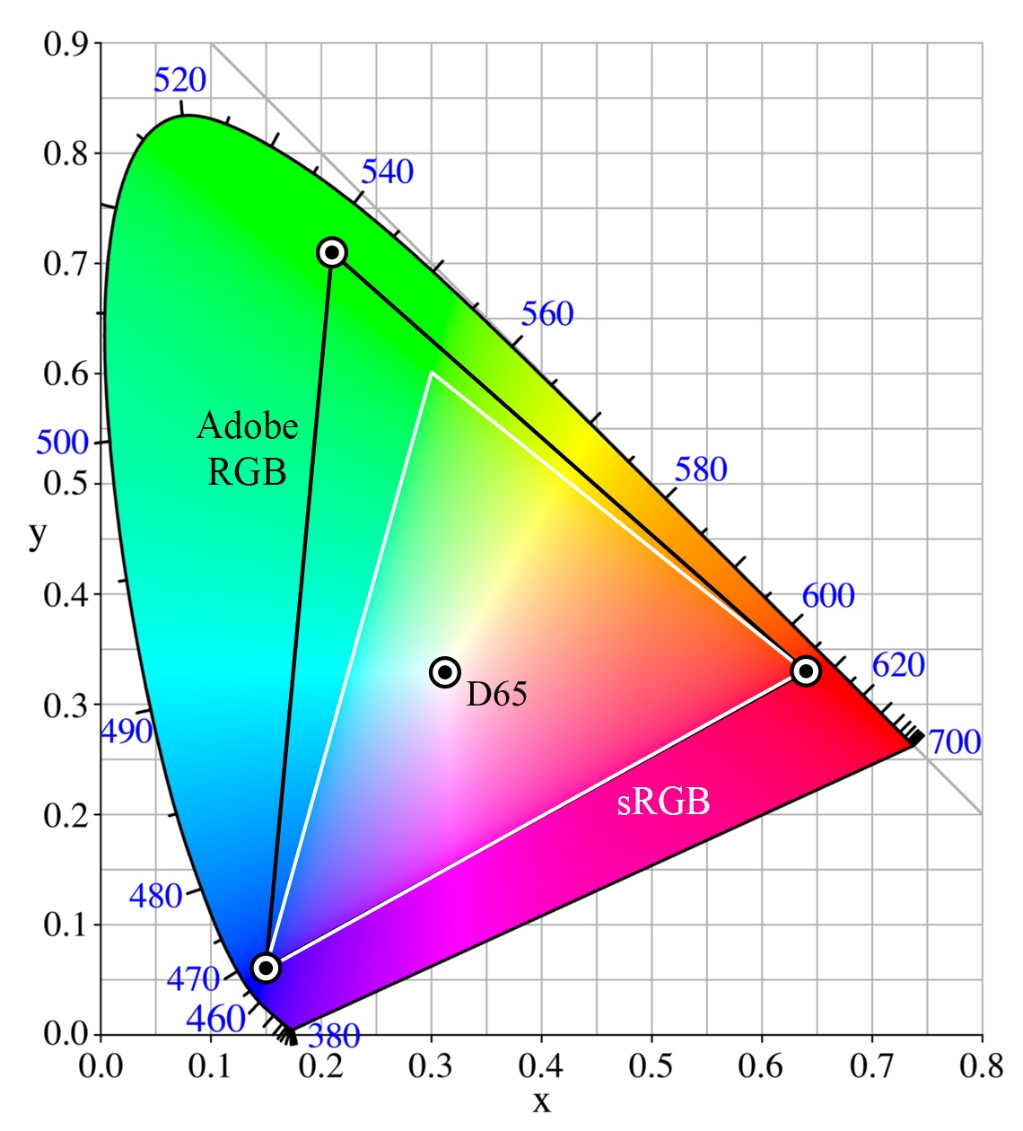
The Adobe RGB color space vs the sRGB color space. Image source: Wikimedia Commons.
iOS can’t deal with the Adobe RGB color space, which is why images matched to that color space look washed out when viewed on iOS devices. In order to avoid that, images must be color-matched to the sRGB space instead.
Therefore, if you’re working with JPEG files that happen to be matched to the Adobe RGB color space, you need to you make sure your images are converted to the sRGB color space before copying them over to your iOS device, or you’re simply going to end up with washed out colors.
Unsurprisingly, this is exactly what Apple recommends doing (again, from the same iOS Developer Library document):
When your content is imported, convert it to the working color space sRGB. Even if your media is in a wider gamut (for example, raw photos), and your monitor can display wider than the sRGB gamut, your color managed application will translate those colors to sRGB, the color space for the finished product. By using an sRGB working color space you can get an accurate prediction of what your media will look like when displayed on the actual iOS device.
As you may have guessed by now, most of my images had been matched to the Adobe RGB color space when I exported them to JPEG from my RAW files using Lightroom. This caused the weird effect you saw at the beginning of the article. It may sound like an insignificant detail, but the impact it can have on your images is profound. Here’s another example:

Luckily, if you’re experiencing this issue with your own images, there’s a simple way to configure Lightroom — or, I’m sure, your photo-editing application of choice — to make sure we always use the correct sRGB profile when exporting our images as JPEGs. Let’s see how we can do it.
Lightroom’s “Export…” dialog
We access Lightroom’s export dialog via the menu item:
File->Export…
Alternatively, you can use the keyboard shortcut ⇧⌘E.
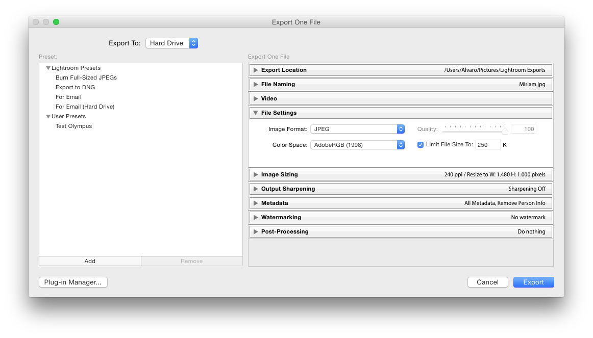
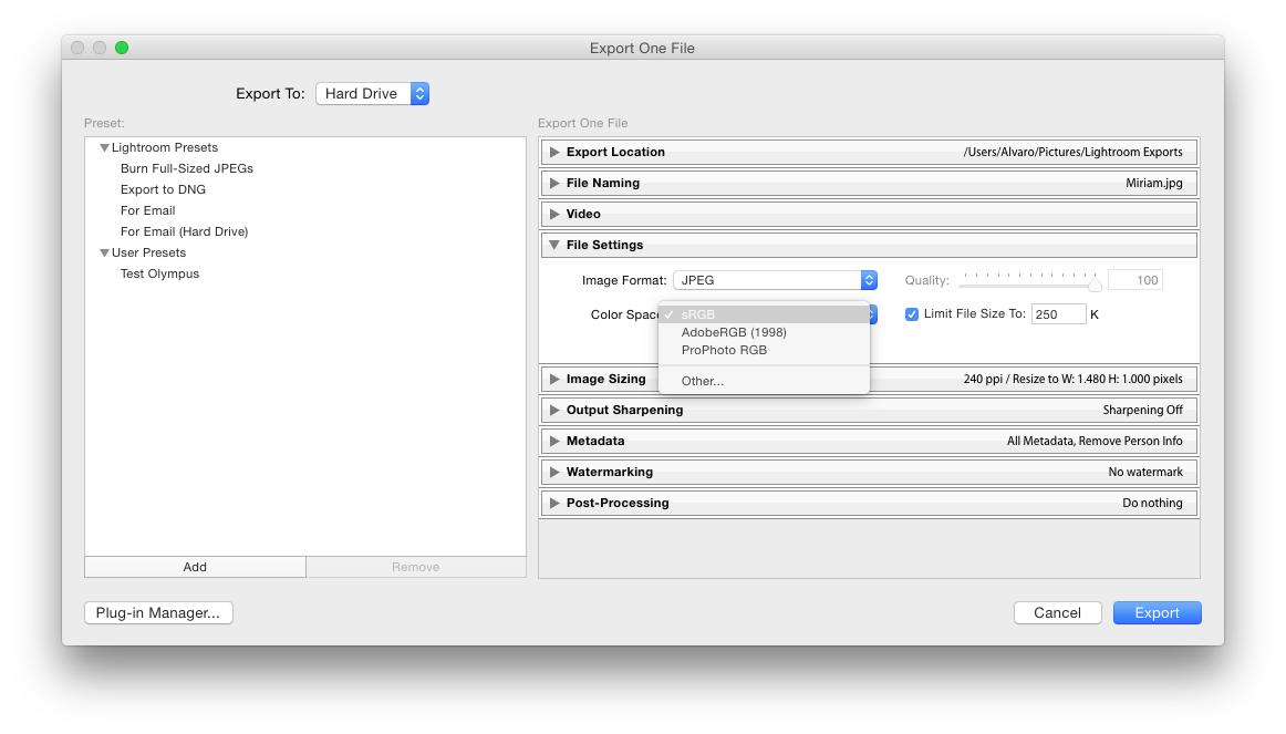
On this dialog, we can configure the export settings for this batch of images, including their size, quality, resolution, name, metadata, etc. Crucially, it is here that we can select the appropriate color space for our files, too.
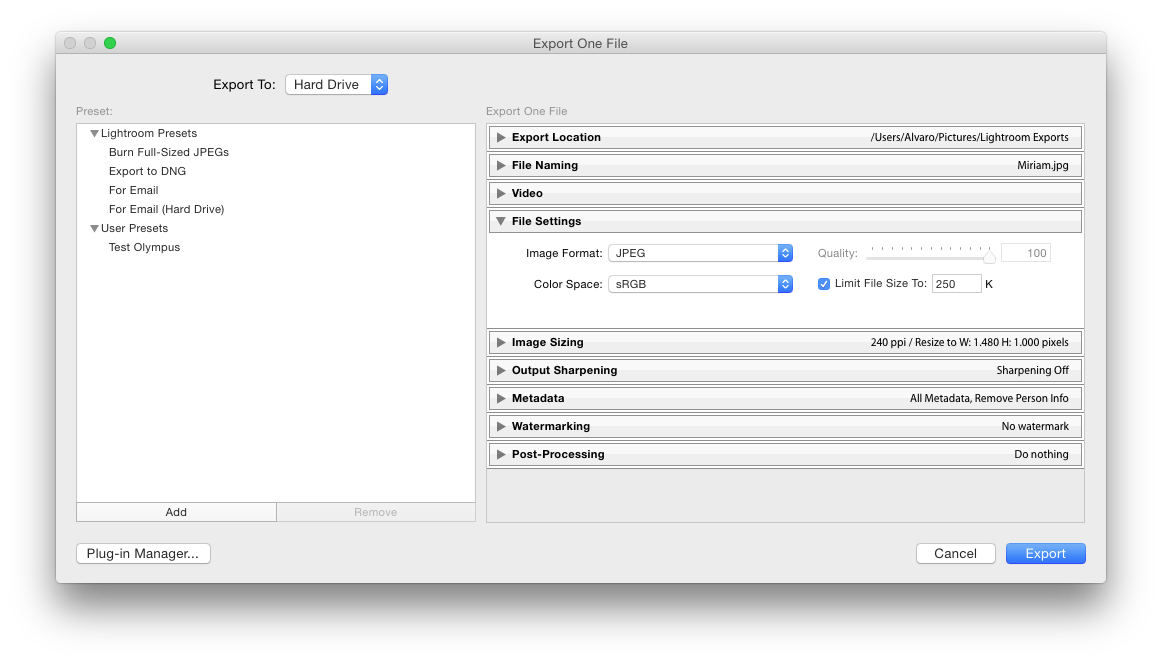
In order to do that, we must set the “Export To” drop-down menu on the top left to “Hard Drive”, and in the “File Settings” area on the right, we must set the “Color Space” drop-down menu to “sRGB”.
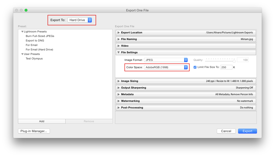
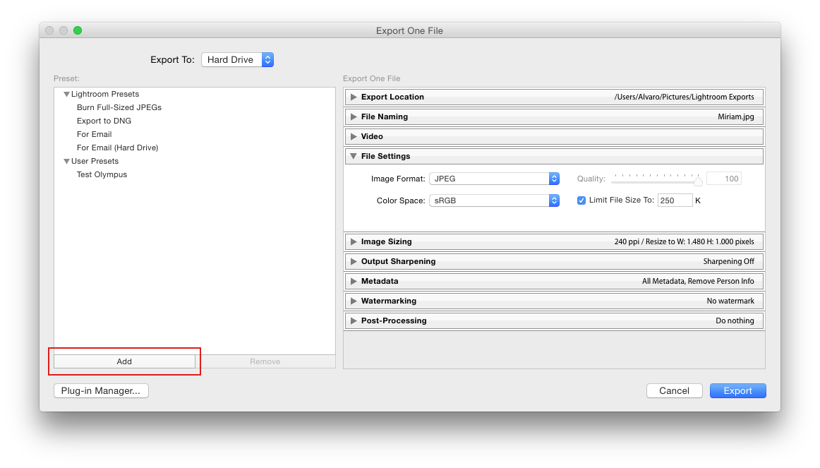
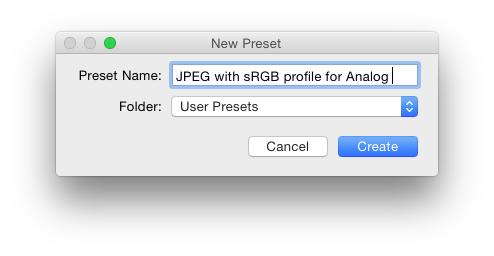
Once we’ve done this, we can save our settings as a new preset by clicking on “Add” in the lower left area, selecting a name for our preset and clicking “Create”. This way we’ll be able to simply select our preset next time we want to export photos, and everything will be properly configured.
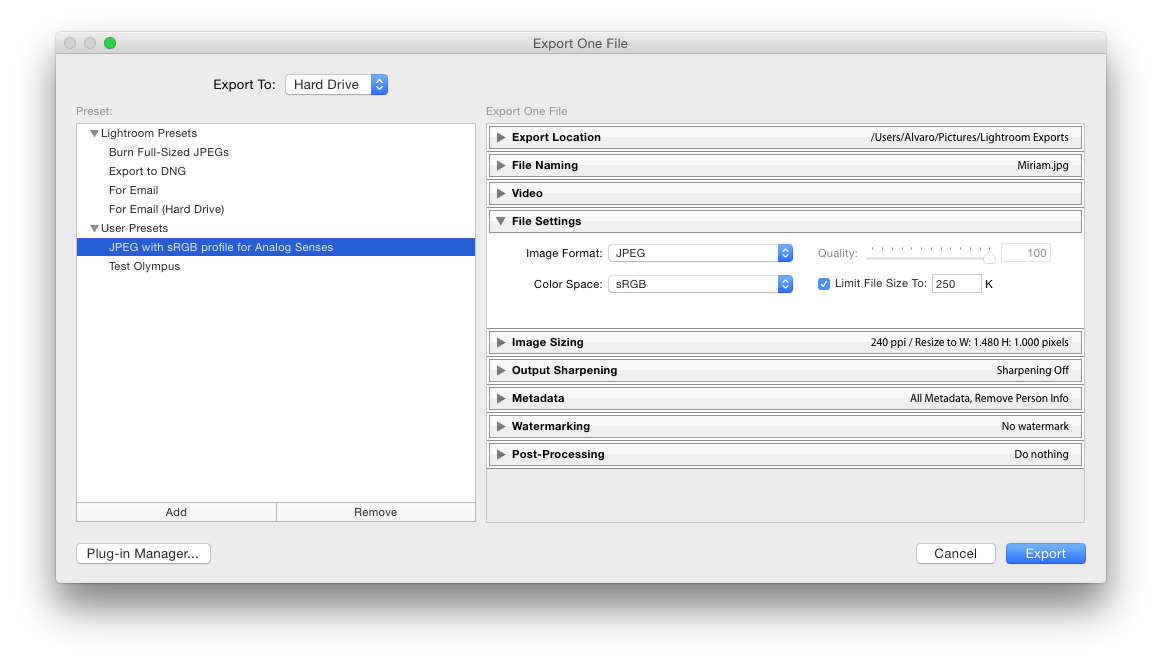
And that’s it. As with most obscure settings, it’s really simple to change this one, but you absolutely need to know what you’re doing.
Reasonable expectations
This was one of the most frustrating tech-related issues I’ve experienced in years, in no small part because I’ve realized that all images ever published on Analog Senses — not to mention in my reviews for Tools & Toys — use the wrong color space, and therefore they all look wrong on mobile devices. That’s something that pisses me off to no end.
Solving this problem was not technically difficult, but it required a level of research and technical reading that I’m not sure most people would feel comfortable doing. There needs to be a better way to approach color management on iOS, one that works for all users, not only those technically savvy enough to navigate their way through Apple’s obscure support document library.
What I find most appalling about all this is that by design, the burden to make sure our images are matched to the correct color space falls squarely on us, the users. This may make sense from an engineering and resource-consumption standpoint, but from a user experience point of view, it leaves much to be desired. In general, I can’t help but feel that color management is something that should always happen automatically behind the scenes.

This is how colors should always look.
It may have required a wild dose of ignorance and bad luck together for me to run into this issue, but I don’t think it’s unreasonable for normal users to select the Adobe RGB color space when prompted to choose one by Lightroom, simply because it’s probably the only one that sounds vaguely familiar to non-tech people.
Moreover, since the difference is not immediately obvious on a computer screen, most users probably won’t realize what’s happened until they view their images on a mobile device, and by then it may be too late to do something about it.
If you want to make sure your images are always displayed accurately on mobile devices, follow the above steps (or find the appropriate ones for your photo-editing application of choice) to make sure you’re always using the sRGB color space when exporting your images. Yes, it’s a small additional step to add to your workflow, but it may save you a ton of headache down the road.

♤ ♧ ♡ ♢
Lenovo used a hidden Windows feature to ensure its software could not be deleted →
Owen Williams, writing for The Next Web:
The users discovered the issue in May when using a new Lenovo laptop that automatically and covertly overwrote a system file on every boot, which downloaded a Lenovo updater and installed software automatically, even if Windows was reinstalled from a DVD.
The only problem is that nobody actually asked for this software, and it persisted between clean installs of Windows. Lenovo was essentially exploiting a rootkit on its own laptops to ensure its software persists if wiped.
Stay classy, Lenovo. Here’s some free advice for you: if users want to get rid of your software so bad that they’re formatting their entire drives, forcing it up on them may not be the best way to go. How about making sure your software doesn’t suck in the first place?
♤ ♧ ♡ ♢
The Sweet Setup picks Google Photos as the best cloud photo management solution →
If you’re on the lookout for a new cloud photo management solution, this excellent piece by Bradley Chambers has everything you need to know.
Overall, Google Photos looks like an incredible value, but there’s the matter of compression:
Google has two pricing options for its photo solution: free with unlimited storage, or the normal Google Drive pricing ($1.99/mo for 100 GB, $9.99/mo for TB, etc). The free solution is recommend for phones or point-and-shoot cameras that are 16 megapixels or less. The free solution does apply a slight compression to your media in order to save storage space.
The compression appears to be incredible. Since I keep local copies on my Mac — I recommend that you keep at least one local copy that is backed up to Backblaze — I don’t mind the compression, as it allows me to use the free version.
Such a clever workaround. By keeping a local copy of his full-resolution files and backing it up to a different cloud service, Bradley is able to take advantage of everything Google Photos has to offer without paying anything at all.
Think about it: while you generally do want to keep your pictures accessible from all your devices, you may not necessarily need to access the full-resolution versions all the time. I have literally no use for a 16-Megapixel file on my iPhone, for example. Just knowing they’re safe somewhere is effectively all you need.
Update: As CJ Chilvers pointed out on Twitter, there’s no information on privacy, which is certainly an important factor that needs to be considered.
Google doesn’t have the best track record when it comes to respecting your private data, and giving them access to your entire picture collection is pretty much handing them a detailed map of your whole life.
Everything in life has hidden costs, particularly free things like Google Photos. In this case, the cost comes in the form of personal data. Whether that tradeoff is worth it is something each of us must figure out by ourselves.
♤ ♧ ♡ ♢
Madrid on film: a few Kodak Portra 800 sample shots →
Here are a few images from a roll of Kodak Portra 800 I shot on Sunday, to give you an idea of how well Michael Fraser’s previously-linked workflow for scanning color negative film works. Follow the title link to see these pictures — and a few more — at their original resolution on Flickr. I will continue to add images to the album as I scan more.

Instead of a DSLR, I scanned these images using a dedicated 35mm film scanner. Following Michael’s advice, I scanned them as gamma-encoded TIFF files instead of linear RAW files. The rest of the process is exactly as described in Michael’s original post.

Not bad at all. While there is still some slight variation across images, I’m really happy with the results I’ve been getting so far, and see no reason to continue using ColorPerfect in my everyday workflow.

♤ ♧ ♡ ♢
When Bic told women to “Think like a man” →
Marisa Bate takes Pen manufacturer Bic to the woodshed on account of their incredibly tone-deaf ad campaign on National Women’s Day:
That all changed around 10am yesterday. The internet caught wind of Bic’s #HappyWomensDay campaign and the maker of the world’s most inconsequential stationery became the internet’s Most Sexist Thing Ever in a couple of moments.
The advert shows a woman smiling, with the phrase “Look like a girl, Act like a lady, Think like a man, Work like a boss”.
I forwarded it on to two colleagues who had an identical response: “Is this a joke?”
Funny thing is, at the end of the day the joke was on Bic. In a matter of minutes, thousands of responses from all over the Internet ranged from hilarious to downright scathing.
I tried to make that Bic advert a bit more relatable pic.twitter.com/d0YLcdqxXM
— TechnicallyRon (@TechnicallyRon) August 11, 2015#epicfail for Bic pens with their #happywomensday post.
Beyond comprehension.
Oh - and the viral answer. pic.twitter.com/cZ0wBwEtNg
— molocapetown (@molocapetown) August 11, 2015Here’s hoping that, at the very least, Bic’s executives learn something from this. Although, if the company’s history is anything to go by, chances are slim.
♤ ♧ ♡ ♢
Michael Fraser’s color film scanning workflow, part 3 →
The third and final part of Michael Fraser’s DSLR-based color negative film scanning workflow was published yesterday, and it’s amazing. I’ve recently been asking Michael for help on Twitter in order to fine-tune my own workflow, which is based on his previous articles, and he’s been incredibly helpful and nice. The tweaks he’s made in this final post make all the difference in the world, and the included screencast is super informative and easy to follow. 100% recommended.
♤ ♧ ♡ ♢
Marco Arment on the ethics of modern web ad-blocking →
Solid piece by Marco Arment on the unstoppable rise of ad-blocking software:
All of that tracking and data collection is done without your knowledge, and — critically — without your consent. Because of how the web and web browsers work, the involuntary data collection starts if you simply follow a link. There’s no opportunity for disclosure, negotiation, or reconsideration. By following any link, you unwittingly opt into whatever the target site, and any number of embedded scripts from other sites and tracking networks, wants to collect, track, analyze, and sell about you.
That’s why the implied-contract theory is invalid: people aren’t agreeing to write a blank check and give up reasonable expectations of privacy by clicking a link. They can’t even know what the cost of visiting a page will be until they’ve already visited it and paid the price.
Whenever a tool arises that gives users back the control they never should have lost in the first place, you can bet your mortgage people are going to jump on it. However, I’m not convinced this will be a serious problem for publishers until these ad-blocking tools are enabled by default across all modern web browsers, much like pop-up blockers today.
As much as we like to think that people on the Internet know what they’re doing, the vast majority of them still don’t know what an ad-blocker is, much less how to use it or even why they should use it. In fact, I’d bet most people haven’t even stopped to think about Internet ads for a second. Regular people that are not technically informed just don’t seem to care about those things, and value their privacy incredibly poorly.
The truth is, those of us who care about privacy, responsible advertising, and ethical data collection, are grossly outnumbered by those who simply don’t.
Just think of Gmail, Android, or Facebook, to name but three companies/products with a huge vested interest in collecting as much of their users’ private data as they possibly can. If people were really informed about the lengths these companies will go to in order to collect their data, there’s no way in hell those products would be nearly as popular as they continue to be.
♤ ♧ ♡ ♢