This is a reference style guide for Analog Senses. The purpose of this document is to show how the most commonly used HTML elements are displayed on the site. Style guides are useful when working on a site’s CSS, as they allow you to instantly see if anything breaks.
Analog Senses is written in Markdown, and styled using CSS only. For that reason, the contents of this guide may largely apply to other Markdown-based websites. If you’d like to use it for your own site, you can. You’ll probably need to make a few changes to account for some custom handling of certain elements, but this should be a good starting point.
In order to facilitate your own tweaking and testing, this reference document is licensed under a Creative Commons Attribution 4.0 International License, and it’s available as a .markdown file here.
It should go without saying, but I’m not obligated to offer support of any kind to go with the file, so use it only if you know what you’re doing, and only at your own risk.
Now let’s start with some general considerations.
Type and spacing
This is an example paragraph. It shows the default body type, as well as the spacing. These settings are very important, because they largely define a site’s readability. In the context of this style guide, you should be focusing on the typeface, the line-height, the spacing between paragraphs and so on. It’s important to pick a typeface that is readable on both high-resolution screens and regular screens.
Another great way to enhance readability is to use emphasis when appropriate. This is some bold text, just so you know what it looks like. And since we’re at it, here’s some italics, too. Italics are useful to quote excerpts without using a full-on blockquote, as in: “the quick brown fox jumps over the lazy dog”. And finally, some bold italics, too, just because I can. You’re welcome.
Have you ever heard about hyperlinks? They’re this crazy thing that lets you send people over to different places on the Internet. Here, they look like this. Usually, people want to be able to easily notice links within a block of regular text, so you should pick a clearly different style for them. Traditional etiquette dictates that links should be underlined, but these days anything goes, as long as they don’t look like regular text. Also, nobody calls them hyperlinks anymore.
Headings
By default, your design should support at least three nested levels of headings. The first level, or h1, should be used for article and page titles only, and it should be big and noticeable. Some people maintain that you should only use one h1 heading per article or per page. That makes sense, but there are instances where having multiple h1 headings may make sense. Here’s what an h1 heading looks like:
This is an h1 heading
The second level, or h2, should be used for section or chapter titles, and it should be a bit smaller but still quite noticeable. This is what it looks like:
This is an h2 heading
Finally, the third level, or h3, can be used to further divide each section into subsections. It looks like this:
This is an h3 heading
Obviously, headings get smaller with each level. You can go onto deeper levels if you need to, like h4, h5 or h6, but in the vast majority of cases on the web, three levels are enough.
Blockquotes and lists
Blockquotes are some of the most commonly used elements on the web, especially on blogs. This is what a blockquote looks like:
This is a blockquote. These are often used to quote entire paragraphs of text from an external source. The way blockquotes are usually styled on the web is by using a left border and indenting both sides. This is such a widespread convention that you probably won’t want to deviate too much from it.
Blockquotes can have multiple paragraphs. In order to make blockquotes stand out, some people use a different color from the main body font, or a different size, or even a different font. Those are valid ways to further differentiate blockquotes from regular text, if you like that sort of thing.
Typically, spacing between a blockquote and the following paragraph — this one — will be a bit larger than between regular paragraphs, but not by much. You can see that in the blockquote above.
Now it’s time for lists. Lists can be ordered (with numbers) or unordered (with just bullet points). Here’s an example of an ordered list:
This is the first item in an ordered list.
This is the second item in an ordered list.
Spacing between the last element of a list — either ordered or unordered — and the following paragraph — this one — should be a bit bigger than between two regular paragraphs, although again, not by much. Now let’s take a look at an unordered list:
This is an item in an unordered list. If we make this item a bit longer, you’ll see how text is justified at both ends of the page.
Any item of any list can have multiple paragraphs. This is the second paragraph of the first item of an unordered list.
This is the second item of an unordered list. Unlike blockquotes, which are usually indented at both sides, lists are normally only indented at the left side. For that reason, this text should run flush against the right margin of the page.
A tricky thing about lists and blockquotes is that they may appear combined with each other:
This is a paragraph inside a blockquote that contains an ordered list. The purpose of this block is to check if the indentation of the list is correct at the left side of the page. Now lets’s take a look at that list:
An ordered list within a blockquote is a difficult thing to style, because it must be indented only at the left side, but it also must remain within the confines of the blockquote, which was already indented at both sides.
For that reason, you should see that the text here runs flush to the right margin, but only to the limit of the blockquote, not the regular body text.
There could also be a blockquote within another blockquote, and your design should support that, as well. Here’s how that looks like:
You can have a regular blockquote that includes another blockquote, as is the case here. The main goal of this first blockquote is to emphasize how indentation becomes bigger in the second embedded blockquote.
A blockquote within a blockquote should have two levels of indentation at both sides, so it should be a bit narrower. This can be a problem on mobile devices with narrow screens, because you can quickly run out of precious space if you’re not careful with your margins.
Perhaps the most unusual combination is a blockquote within a list:
- This is the first item of a list that contains a blockquote. And this is what the guy said:
This is just some random text that should appear as an indented blockquote within the first item on the list.
- After that blockquote, the list can resume as usual.
And finally, the most complex case is a list within another list. Keep in mind that in some Markdown interpreters you need to type two spaces for each nested level, but in the current version of Octopress it takes four spaces for each:
Item 1
A subsection of item 1 on the main list.
Yet another subsection of item 1 on the main list.
Item 2
A corollary to item 2 on the main list that does not require ordering.
You can even have an ordered list within an unordered list that’s itself within an ordered list. Why someone would want to do that, though, I have no idea.
At this point you may want to consider starting a new list from scratch.
This is the second unordered item within item 2 on the main ordered list, in case you were lost.
- And of course, an unordered list that’s within another unordered list that’s within an ordered list… and now I have a headache.
Item 3 on the main ordered list, but who’s counting.
That wasn’t so bad, was it? The problem with lists and blockquotes is that there are so many different combinations and edge cases that it’s difficult to test for all of them when tweaking your CSS. Hopefully, having all cases compiled in this reference document will help with any future edits.
Footnotes
Blockquotes and lists are necessary, but a good design should also support footnotes. Footnotes within normal text are usually marked with superscript numbers, such as this one1. Lately it’s become popular to show the footnote’s contents in a popover when you hover over them with the mouse, or when you tap on them on a mobile device. The more traditional way is to include a link to the article’s footer, where all footnotes are displayed in order, with a link back to each footnote’s original location in the text. There’s no reason you can’t do both in the same design.
External links and separators
Analog Senses features external links as part of the weekly Morning Coffee articles. These links are not post titles, however, so they use h3 headings instead of h1. They look like this:
Analog Senses on Twitter →
The links usually include some commentary. In order to separate them, I use custom separators that look like this:
♢
These are inserted manually in my Markdown files, and then styled with CSS to keep them centered on the page. I also sometimes use them to separate sections within a given article.
Media
Modern sites feature a rich variety of media: photos, videos, tweets, Instagram pictures, etc.2 That said, media can be handled in many different ways and in fact, that could be an article in and of itself. As such, the remainder of this document will focus on how the current design of Analog Senses handles it.
Photos
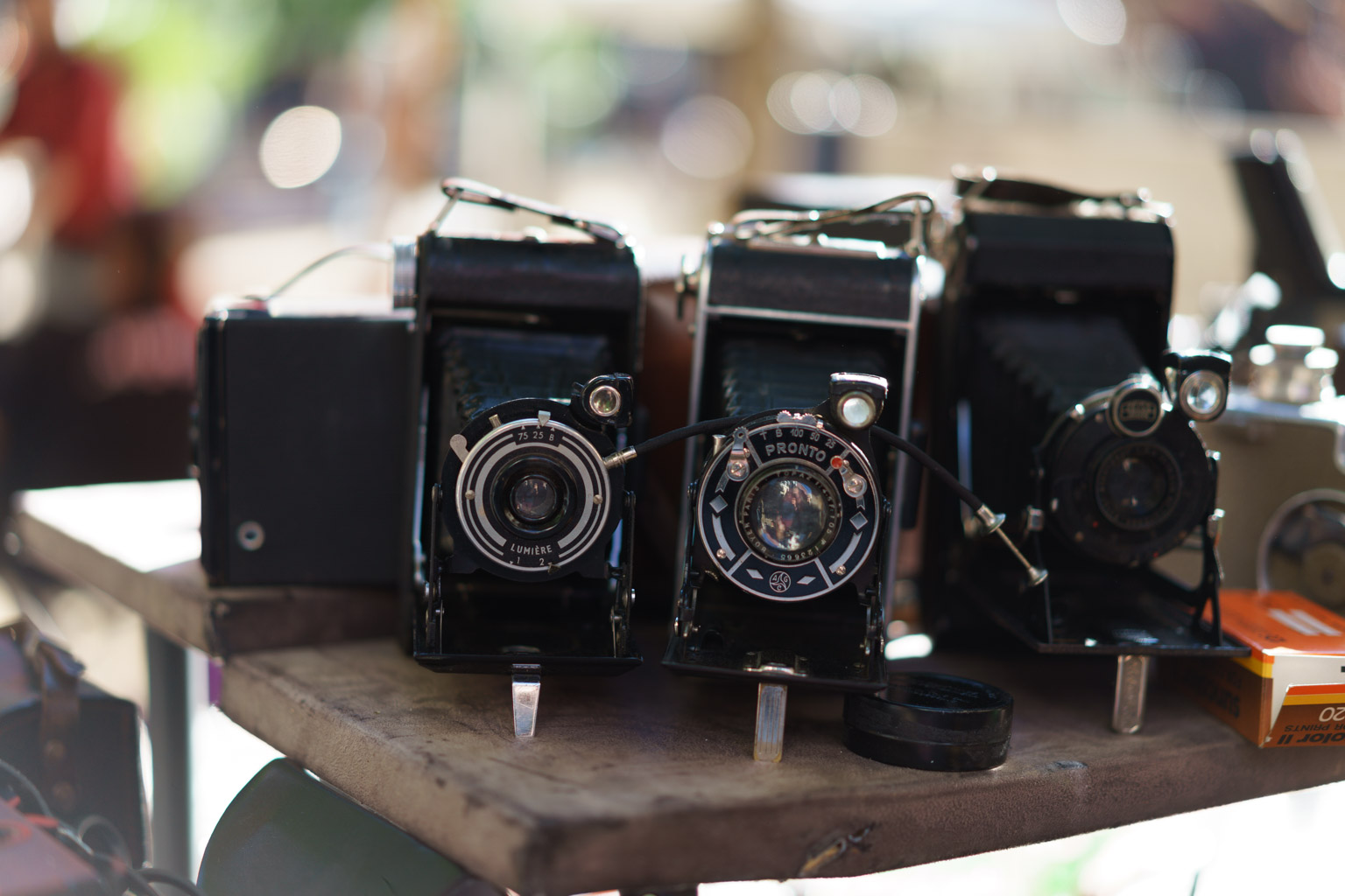
The first option is to have photos embedded within the confines of the main text. In this case, images are never wider than the text itself. This is how that looks:

This is a photo caption. If your site uses pictures from other photographers, this is a great place to give them credit.
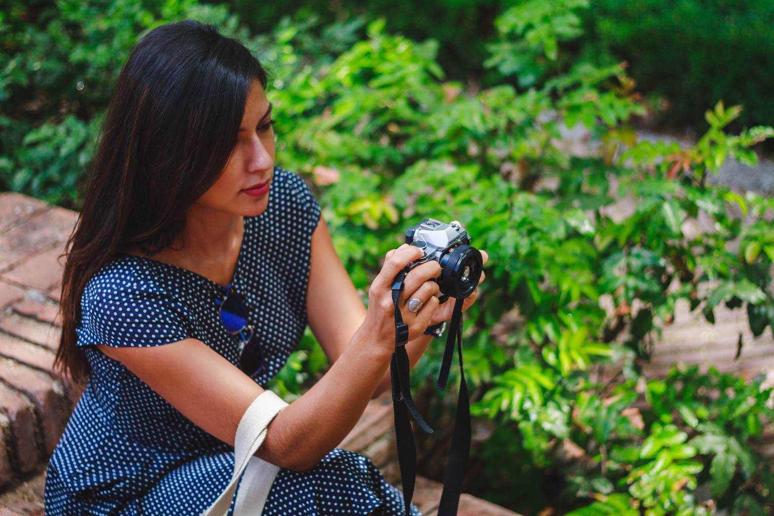
Of course, photos can be embedded in portrait orientation, as well:
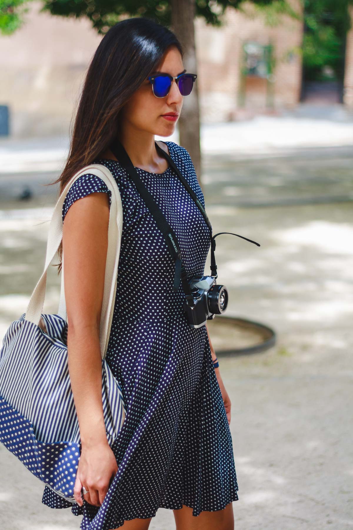
The problem with this approach is that these images will never be displayed at full-width on your screen. And if you’re looking at them on a smartphone, it doesn’t really make much sense to waste valuable space with margins. This approach works very well in some specific cases, so it’s important to support it, but clearly we can do better. Here’s a wider image:
That’s better. This size works well for portrait images, as well. Here’s what a portrait image looks like at this wider size:

I like this size better, but keep in mind that portrait images that are this wide can be harder to view on laptops with widescreen displays. You should find a compromise that works for you there.3
Then there’s an even wider size that is best suited for landscape-orientation pictures. This is what that looks like:
This is a photo caption. If your site uses pictures from other photographers, this is a great place to give them credit.
Obviously, this size is not optimal for portrait-orientation images, as it would take a very tall screen to be able to view the entire image.4
And finally, we can have true full width panoramas, like this one:
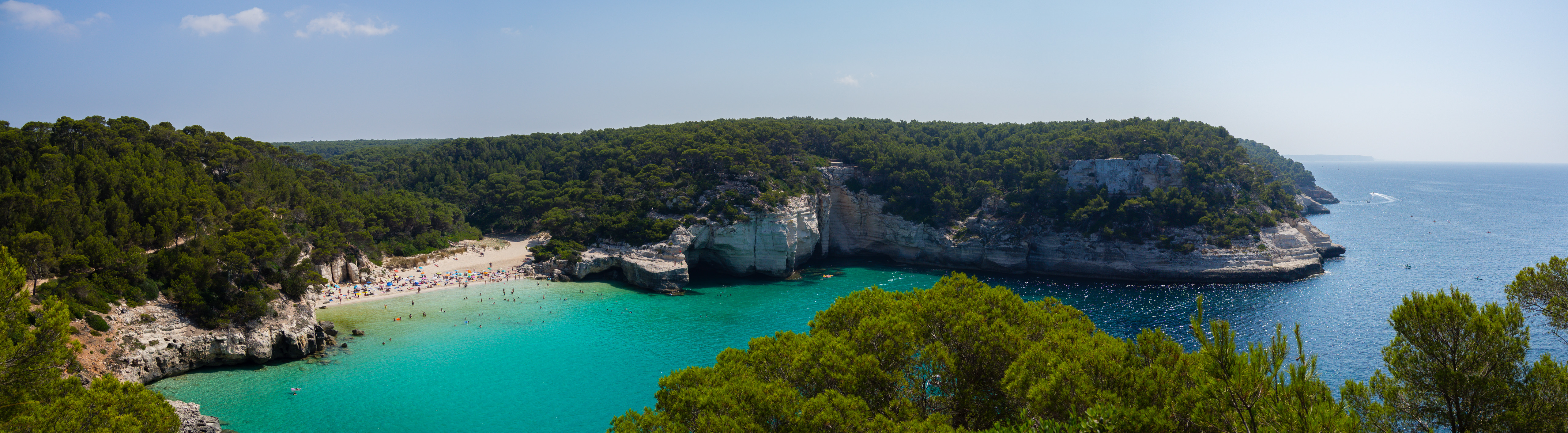
This should extend the entire width of your screen, regardless of the size of your window.
Videos
Videos by default are treated just like photos, and are embedded at the wider size,5 like this:
Videos can have their own captions, too. Since we’re at it, let’s focus for a moment on what happens if we write several lines here. If everything is fine, captions should be sufficiently differentiated from regular body text so as to not confuse readers.
In Octopress, videos are embedded responsively thanks to the Octopress Responsive Video Embed plugin by Udo Kramer.
Tweets and Instagram posts
Embedding tweets is a pretty common thing to do these days, and sometimes they even include embedded media of their own. This is how an embedded tweet with media looks:
That looks nice and clean. Now, just because a tweet has embedded media doesn’t mean we have to display it. It’s entirely possible to embed a tweet without it, just like so:
As for Instagram posts, those can be embedded, as well. Here’s what that looks like:
As you can see, tweets and Instagram posts become full-width when the display is narrower than the embedded media, and they both shrink seamlessly to accommodate any sized screen. That’s all Twitter’s and Instagram’s doing, by the way. Unfortunately, that also means you lose some control over those elements, so things like spacings and so on become complicated to handle when you’re dealing with these elements.
Most popular media outlets offer an embed feature of some sorts, and the results are all very similar to what you can see above, so there’s really no need to dive further into them.
Finally, we can embed Google Maps, as well:
This is a caption in an embedded Google Maps map.
Final words
This style reference guide was created to provide a useful resource to test the design of Analog Senses. In order for the site’s design to be considered correct, everything on this page needs to be rendered properly on any modern device. If this page looks weird on your current device, there may be a bug in the site’s CSS, so if you notice something, please let me know.
If you write in Markdown, this document may be a useful resource to test your own site’s design, as well. Except from some custom handling of certain media types, everything else in this document was written in standard Markdown, with the styling and formatting done entirely in CSS. Again, you can download the contents of this page as a Markdown file here.
♢
Thank you for reading. If you enjoyed this article or found it useful, please take a moment to share it on your preferred social network by clicking on the appropriate link below the footnotes section. Thanks!
-
This is the first footnote. It also comes in handy to tell you that on this site, footnotes are handled by the awesome Footnotes Popover plugin by Matt Gemmell.↩
-
Apart from being footnote number two, this is to let you know that, due to the sheer number of different media sources that can be used on the web these days, this document will only focus on the most common ones.↩
-
In the current design, pictures at this size become full-width on displays that are 768-pixels wide or narrower. That means they should take up the entire width of the screen on every iOS device in portrait orientation, except for the iPad Pro. If your device is in landscape orientation, they should be full-width on every iOS device except the iPad — any iPad, including the iPad Pro.↩
-
These images will be displayed at full-width on any display that is 1,204-pixels wide or narrower. That includes every iOS device in every orientation, except for the iPad Pro in landscape mode only.↩
-
Like photos, videos are also full-width on any device that is 1,024-pixels wide or narrower. Again, that includes every iOS device in every orientation, except for the iPad Pro in landscape mode only.↩