As you may have noticed, things look slightly different around here today.
You’re looking at the first site redesign in almost two years, and though things admittedly haven’t changed much, hopefully they have changed for the better.
You see, after years of making occasional tweaks here and there on the site’s CSS, the entire file had turned into a bloated mess, with many redundant and/or contradictory directives, to the point where making even the most trivial changes had become a challenge.
Good CSS hygiene is very important to the well-being of any site. When you discover a horrible bug in the design — and I do mean when, not if — the ability to fix it quickly and safely can save you a ton of downtime, and quite a few headaches.
With that in mind, a few weeks ago I decided it was finally time to clean up my own mess, and I’ve since been rewriting the site’s entire CSS from scratch. Today, I’m ready to publish the revised design, which you’re seeing right now.
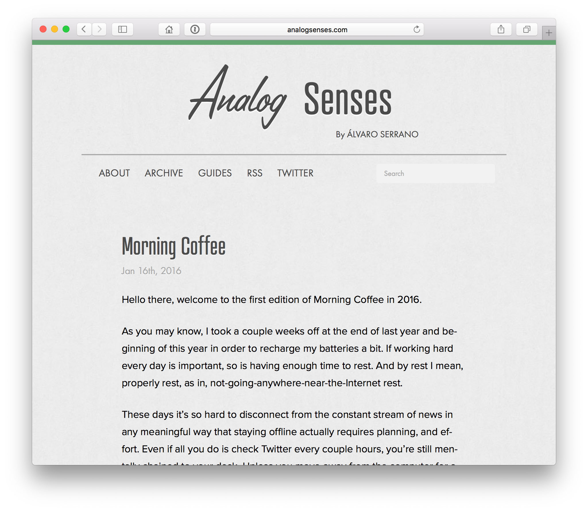
For future reference, this is what Analog Senses looked like up until yesterday:
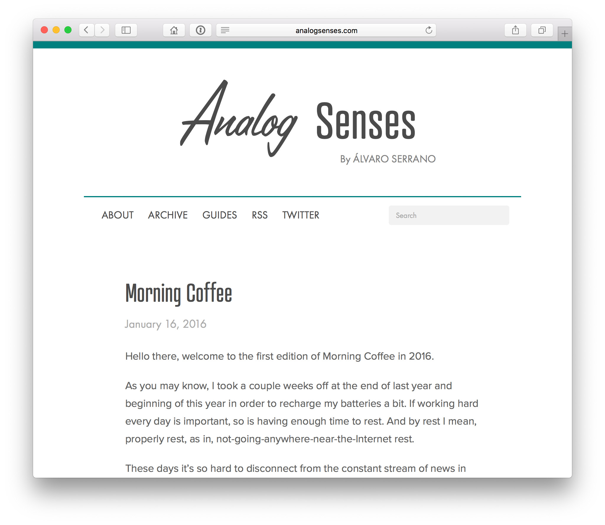
And this is what it should be looking like right now:
Human beings don’t usually like change, but I have to say the new design has grown on me surprisingly quickly, to the point where I can now barely look at the old one anymore.
I’ve been really looking forward to launching it for the past few days, but I didn’t want to rush things. All it takes is one bug to make the entire launch a disaster, so I wanted to make sure I crossed all my t’s and dotted all my i’s before hitting publish. That ultimately proved to be the right choice, as I had to fix a last-minute issue yesterday that prevented me from launching it, despite that being my original target date. Clearly, you can never be too careful.
Reference style guide
When you’re working on a site redesign, a style guide can be a wonderful resource.
The purpose of a style guide is to show how the most commonly used HTML elements are displayed on the site. Style guides are very useful when working on a site’s CSS, as they allow you to instantly see if anything breaks.
As part of the current redesign, I’ve created a reference style guide for Analog Senses, which you can see here. In order to facilitate your own tweaking and testing — on your own site, that is — I’m also making it available as a standalone document.
Said reference document is licensed under a Creative Commons Attribution 4.0 International License, and it’s available as a .markdown file here.
Analog Senses is written in Markdown, and styled using CSS only. For that reason, the contents of that document may largely apply to other Markdown-based websites. You’ll probably need to make a few changes to account for some custom handling of certain elements, but this should be a good starting point.
It should go without saying, but I’m not obligated to offer support of any kind to go with the file, so use it only if you know what you’re doing, and only at your own risk.
Now, let’s go over the new design in a bit more detail.
Subtle changes on the outside, profound ones on the inside
If I had to describe the new design in just a few words, I’d say it’s the Snow Leopard of site redesigns. At first look, not much seems to have changed from the previous design, but changes on the inside have been profound. As they say, everything needed to change, so things could stay the same.
Colors and typography
The most noticeable change is, of course, the color scheme. Gone are the gray textured background and greenish links, in favor of a clean white design with beautiful teal accents. I’ve always loved teal, and luckily for me, it’s recognized by name by HTML, so that was an easy choice.
An important benefit of the new design over the old one is that it doesn’t rely on any image files except for the tiny favicon. That means loading times should be even faster, and pages should be leaner. It’s a win for me, but also a win for readers, as it should be.
Fonts used throughout the site remain the same, but again, colors, spacings and sizes have been changed in order to enhance the reading experience. The header fonts are Lamplighter Script, Futura PT and Atrament Web, which is also used for the headings. The main body font is Proxima Nova.
Media handling
Perhaps the coolest new feature is that the site now supports full width images and videos up to 1,024-pixels wide (2,048 on Retina displays). This is something I’d been wanting to implement for a long, long time, but I never really got around to it. Now it’s finally done, and the results are pretty cool, if I may say so myself.
Again, for future reference, this is what the widest images looked like in the previous design:
You can clearly see the margins at both sides of the image there. This is what that same image looks like now:
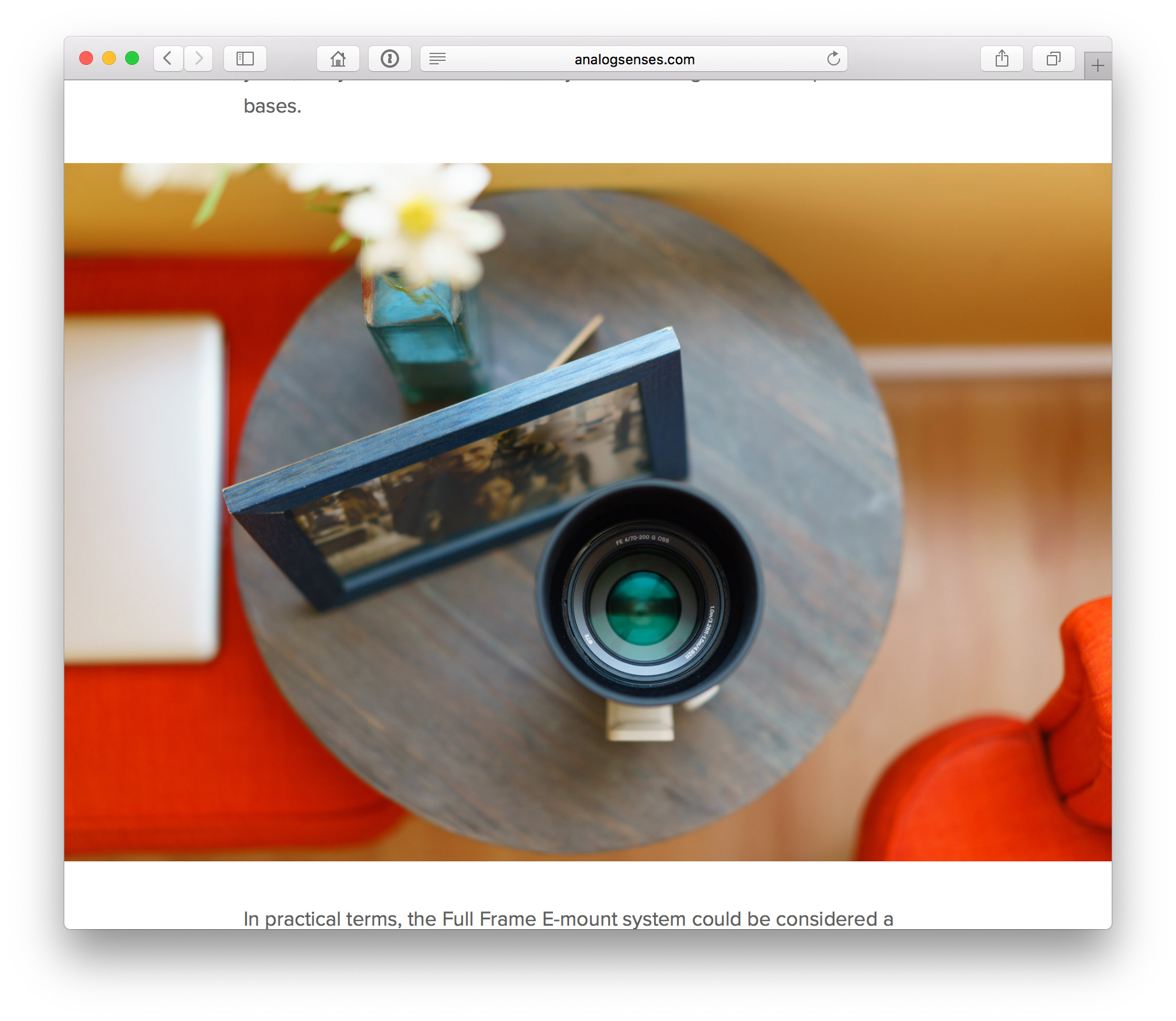
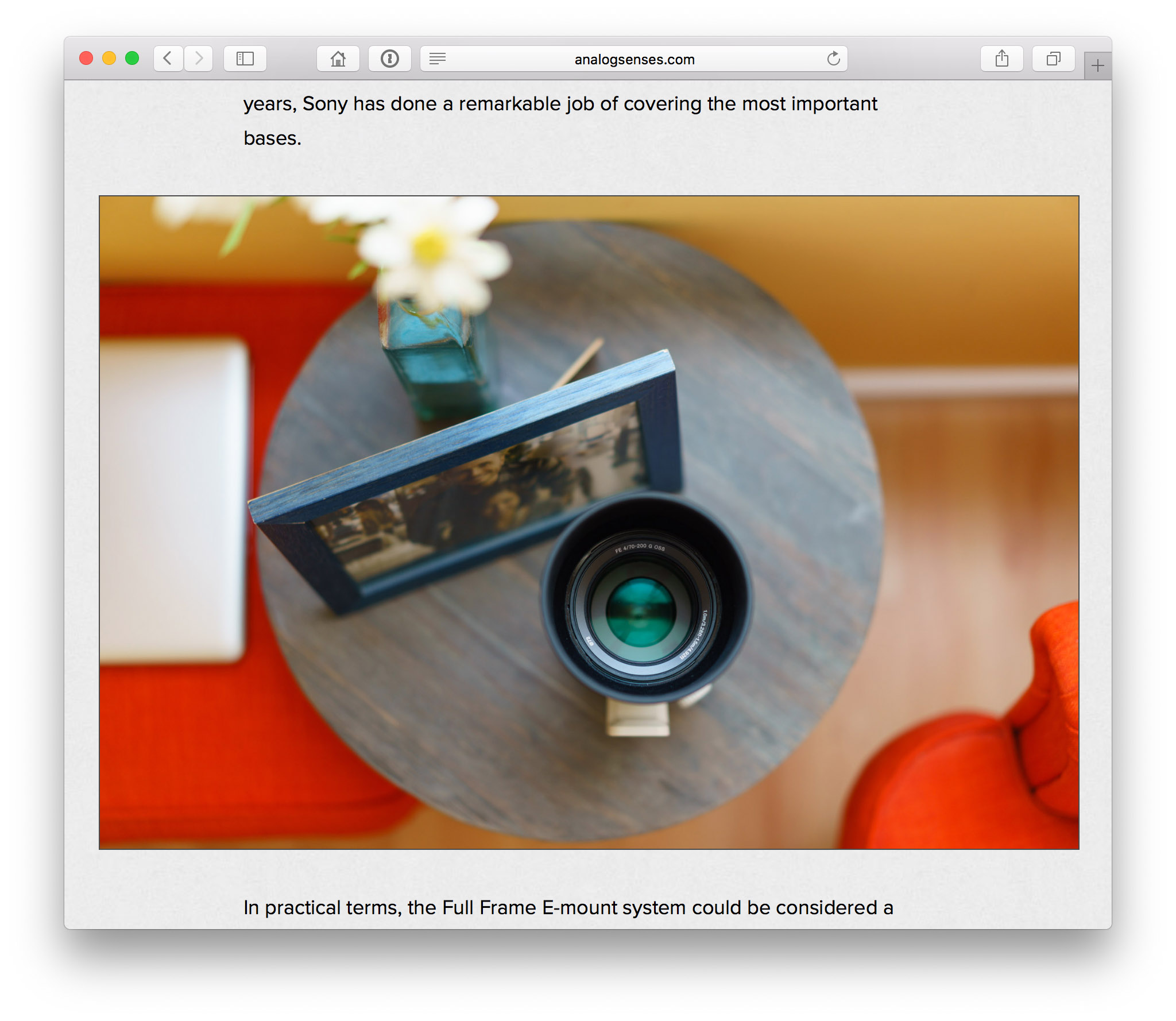
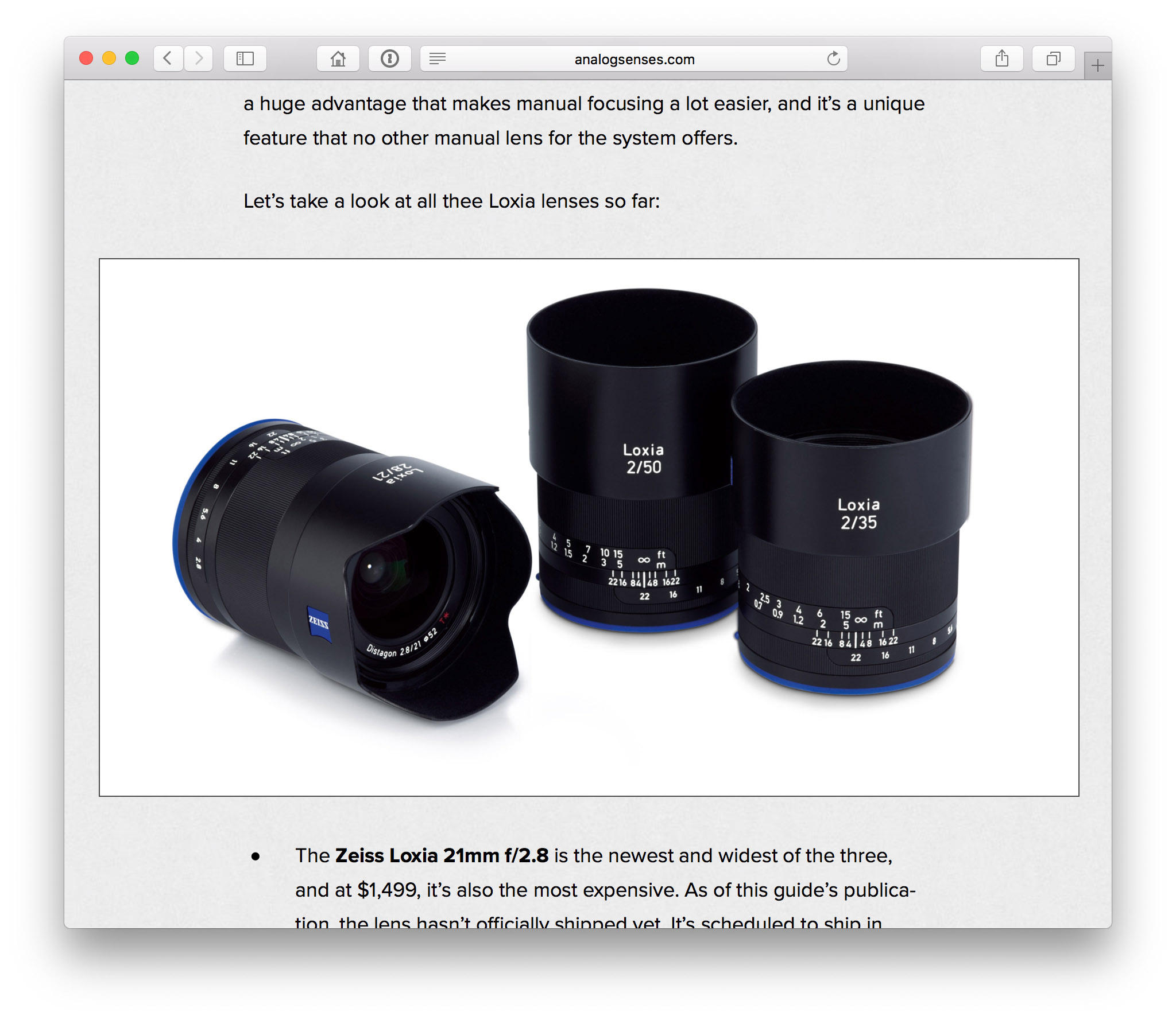
Another detail about this is that images are now borderless, which can yield great results when used with the right type of image. Check this image from my Sony E-Mount lens guide, for example. This is what it looked like before:
And this is what it looks like now:
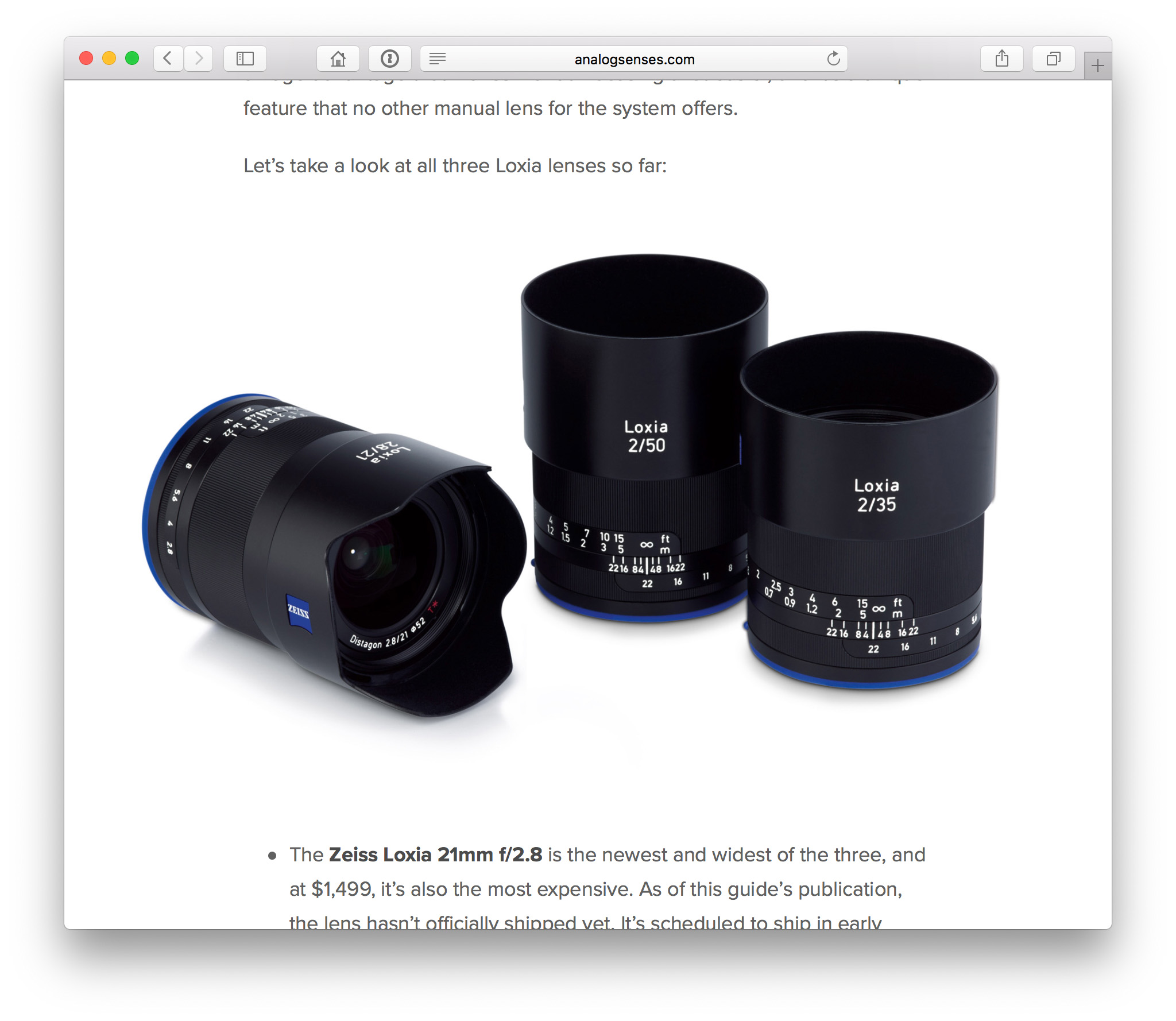
Again, night and day. I don’t know if you’ll agree, but to my eye things look much better in the new design.
Responsiveness
Without a doubt, the feature I’m most proud of is responsiveness, which has been greatly improved in the new design.1
Ever since I started using Octopress to power Analog Senses, back in 2014, the site’s design has been responsive. However, it was full of small inconsistencies that drove me nuts. Things like margins, lists, blockquotes and footnotes behaved very differently depending on the size of the display you were using. Even font sizes were inconsistent throughout the site.
All of that has been fixed now.2 The new design looks great on displays of any size, and it should support every modern browser out there. Of course, despite my extensive testing, there may still be some ninja-like bugs hidden in there somewhere, so if you see anything wrong with the way the site loads on your particular device, please let me know.
Regarding mobile devices, the site should look great on every iOS device, past or present. This is what it looks like on the current iPhone models, for example:
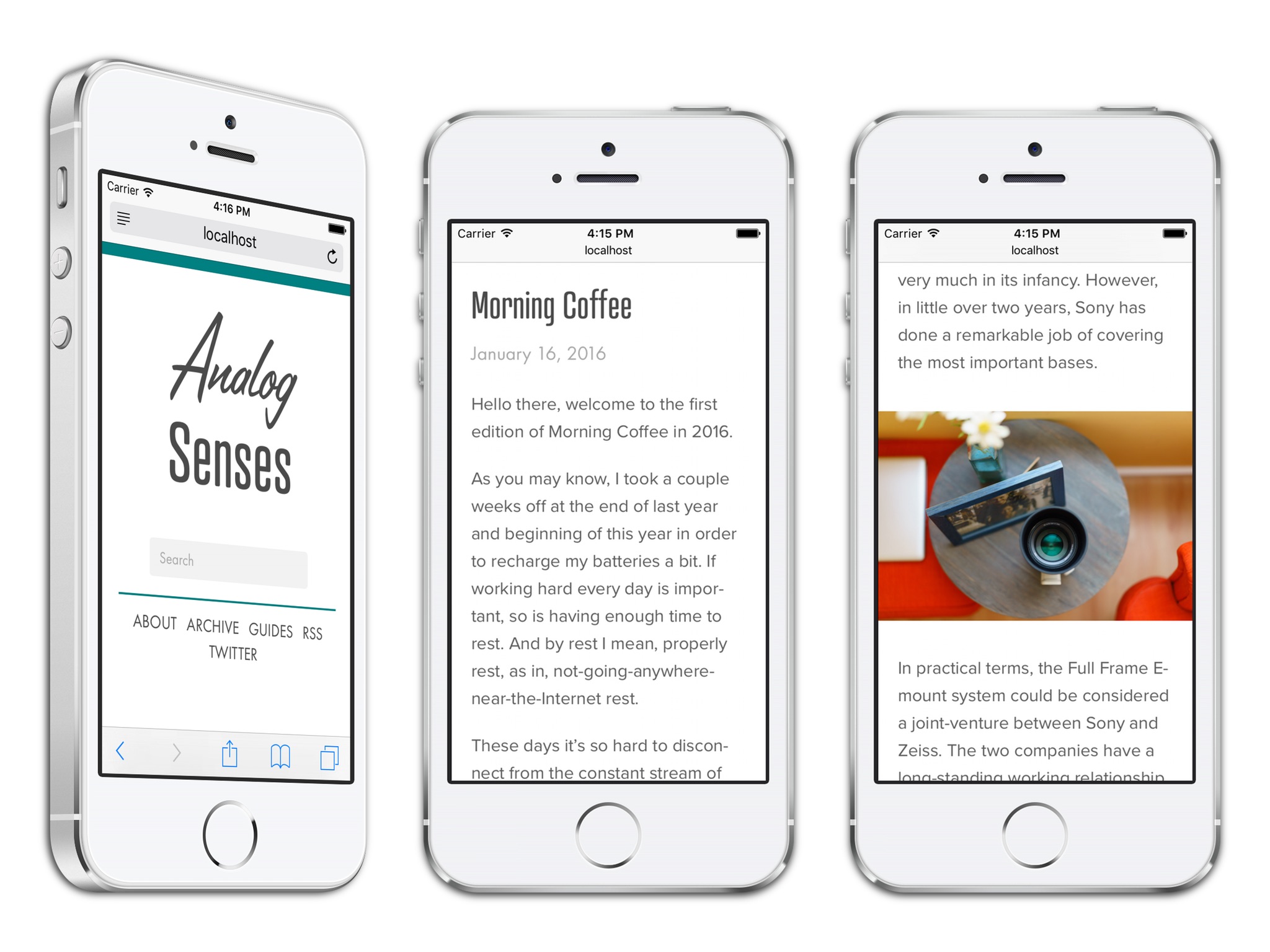
Analog Senses on the iPhone 5s.
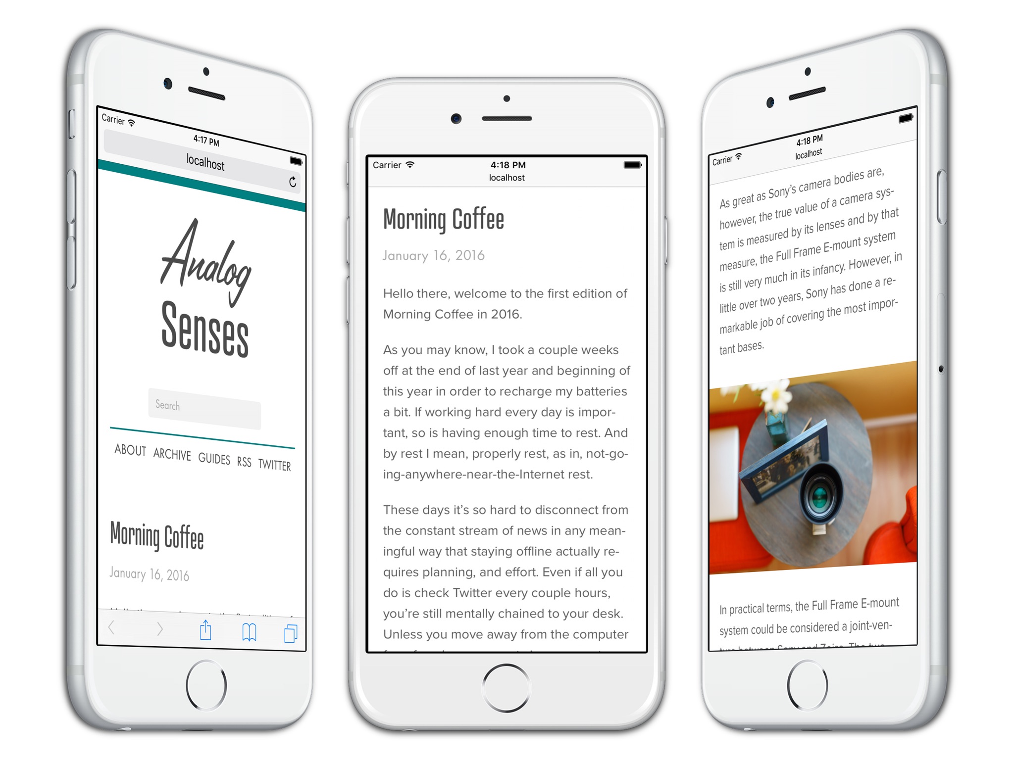
Analog Senses on the iPhone 6/6s.
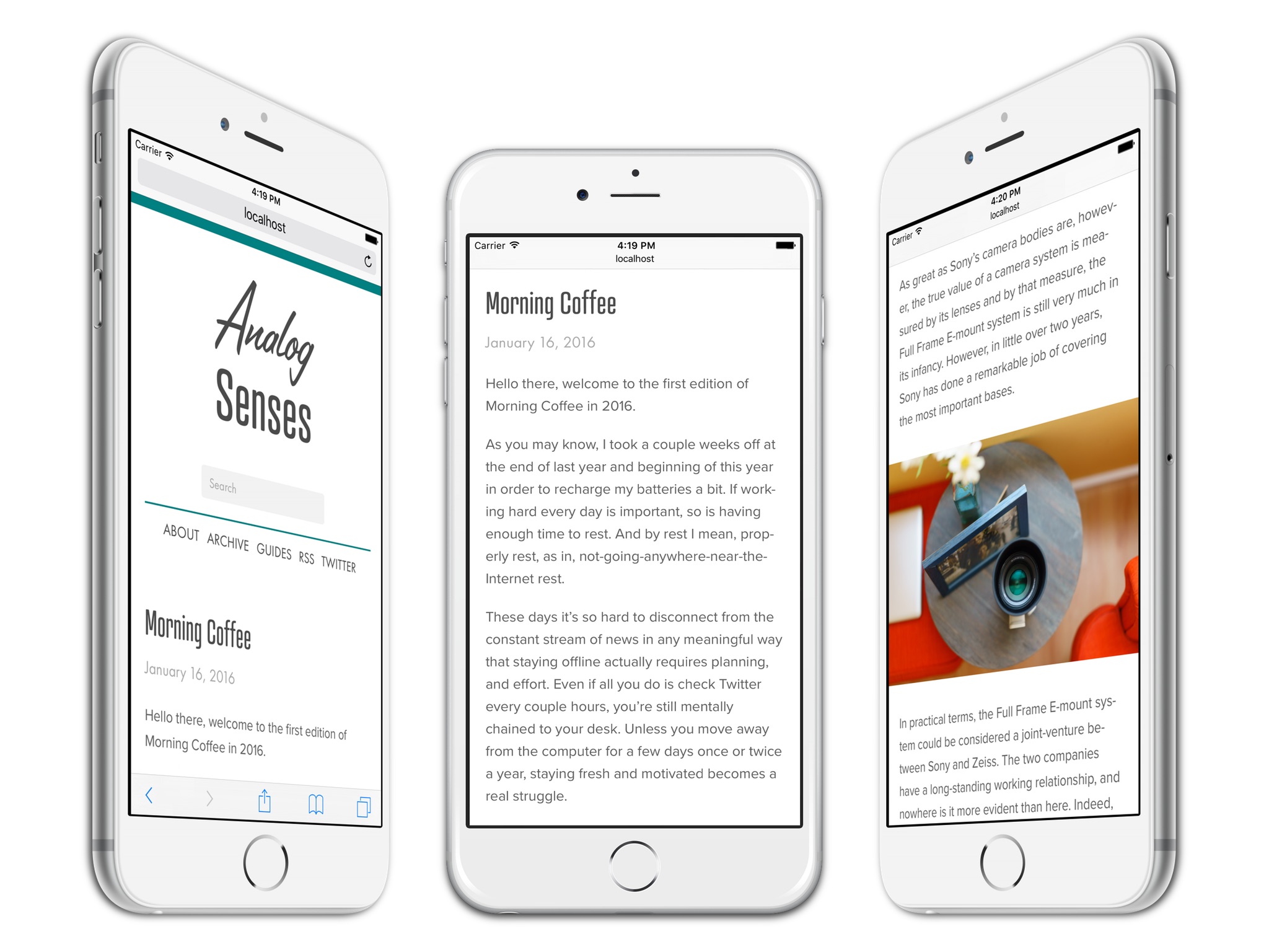
Analog Senses on the iPhone 6 Plus/6s Plus.
I really like how the new full-width images look on the iPhone, especially in portrait orientation, where horizontal space is a very scarce resource. It really didn’t make any sense to waste it with margins.
The site looks great on every iPhone, but I like it even better on the iPad:
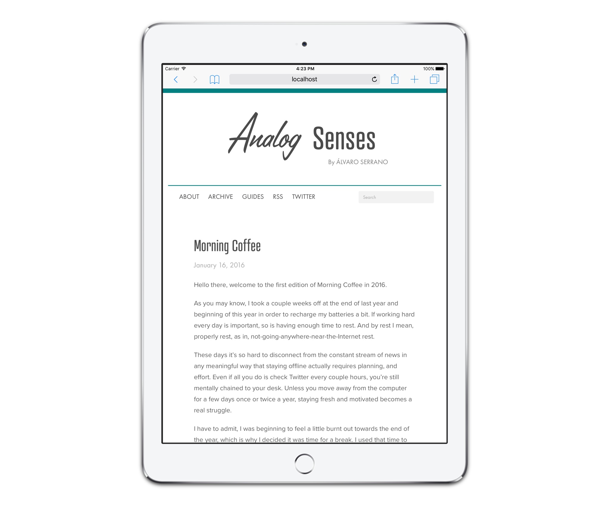
Analog Senses on the iPad Air 2.
This looks and behaves exactly the same as the desktop version, although internally there are a million things that are handled differently. Those are the types of things that were terribly inconsistent in the previous design.
In particular, full width images now look awesome in landscape mode on the iPad:
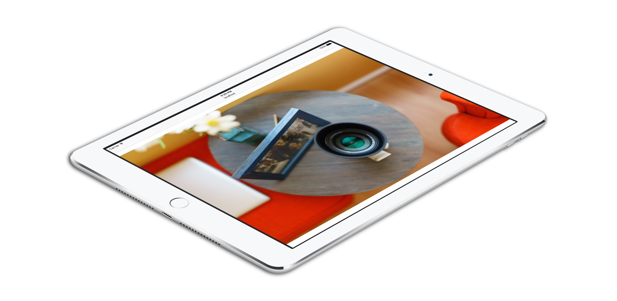
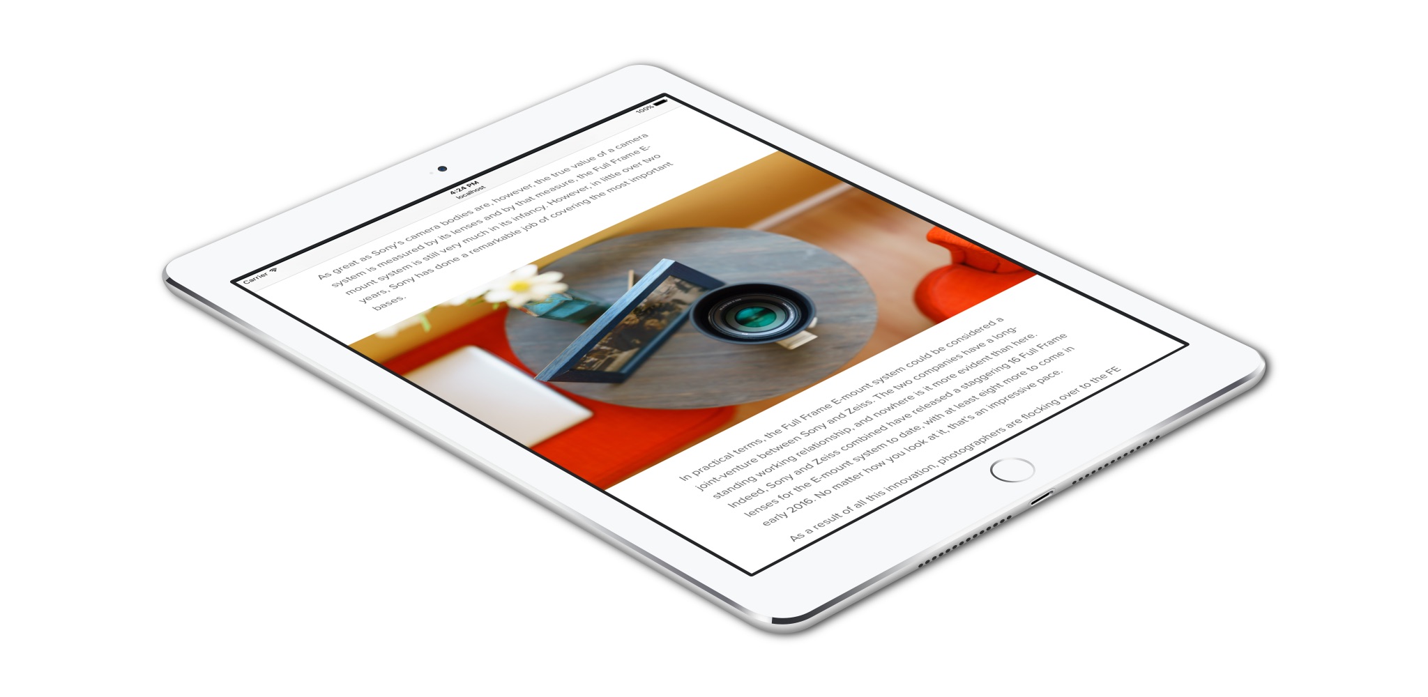
Analog Senses on the iPad Air 2.
That’s how you can get the most out of the iPad’s beautiful display. And since the iPad Pro’s screen has a resolution of precisely 2,732 x 2,048 pixels, images should remain full width even on that device when used in portrait orientation.
Final words
This brief but intense redesign project has been very refreshing, to be honest. I’m quite proud of how the new design turned out, and hopefully it will provide a solid foundation for the future of Analog Senses.
Now, those of you who have read this far probably know that a site’s design is never really finished. Instead, it’s like a living creature with a mind of its own. Even now, on the very day I’m publishing the new design, I can’t help but think about the many features I’d like to add in the future, like support for side-by-side images, a grid-like structure with photos, cool header photos with transparent text, and so on.
Those are all interesting and compelling features, and they’ll probably arrive at some point. For now, though, it really is time to go back to writing.
Thank you for reading.